CCNC/CCNC Module 6/Inserting Graphics/Subsection 6 Inserting Charts
| Work in progress, expect frequent changes. Help and feedback is welcome. See discussion page. |
| Inserting Graphics |
Inserting Clip Art |
Inserting Images from File |
Art Gallery and Drawings |
Graphics Operations |
Inserting Charts |
Inserting Charts from Spreadsheets |
Show Me |
Contents
Tutorial 6 Inserting Charts and Tables
Introduction
A chart is a type of information/data graphic or graphic organizer that represents tabular numeric data and/or functions. Charts are often used to visually represent large quantities of data and the relationship between different parts of the data for ease of understanding. Charts can usually be read more quickly than the raw data that they come from. Charts add visual interest and useful information represented by lines, bars, pie slices, or other markers.
Inserting a Simple Table
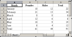
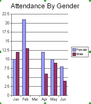
In this tutorial, we are going to add attendance by gender for our monthly courses. We will insert the following table of half year training statistics on a slide.
| Month | Females | Males | Total |
|---|---|---|---|
| January | 10 | 12 | 22 |
| February | 21 | 13 | 34 |
| March | 0 | 0 | 0 |
| April | 12 | 6 | 8 |
| May | 10 | 9 | 19 |
| June | 8 | 4 | 12 |
| Total | 61 | 44 | 95 |
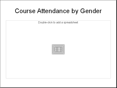
- In the Layouts pane, click the title, spreadsheet layout.
Type the title of the slide
- In the Text box, double-click the icon
- In the spreadsheet window that pops up, enter the data in the table above
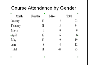
- Double-click on the spreadsheet to get back to the slide
- Resize the table so that it fits the whole slide as shown below
Understanding the Different Chart Types
Impress allows you to create many different kinds of charts to visually accent data.
Area Chart An area chart emphasizes the trend of each value over time. An area chart also shows the relationship of parts to a whole.
Column Chart
A column chart uses vertical bars or columns to display values over different categories. This chart shows variation in value over time.
Bar Chart
A bar chart is similar to a column chart except these use horizontal instead of vertical bars. Like the column chart, the bar chart shows variation in value over time.
Line Chart
A line chart shows trends and variations in data over time. A line chart displays a series of points that are connected over time.
Pie Chart
A pie chart displays the contribution of each value to the total. Pie charts are a very effective way to display information when you want to represent different parts of the whole, or the percentages of a total.
Other Charts
Some of the other charts that you can create in Impress include XY Chart, Net chart, Stock chart, Line (3D) chart, Area (3D) chart, Bar (3D) chart, Column (3D) chart, and Pie (3D) charts.
Identifying the Parts of a Chart
Have you ever read something you didn't fully understand but when you saw that same information in a chart or graph, the concept became clear and understandable? Charts make it easy to see comparisons, patterns, and trends in the data.
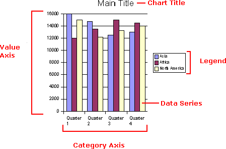
Data Source
The range of cells that make up a chart. The chart is updated automatically whenever the information in these cells change.
Title
The title of the chart.
Legend
The chart key lists each color and identifies what that color represents on the chart. Axis
The vertical and horizontal parts of a chart. The vertical axis is often referred to as the Y-axis, and the horizontal axis is referred to as the X-axis.
Data Series
The actual charted values, usually rows or columns of the source data.
Value Axis
The axis that represents the values or units of the source data.
Category Axis
The axis identifies each data series.
Inserting a Simple Chart
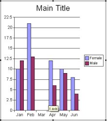
For this tutorial, we will present the table discussed in the previous section as a bar chart. To do these, we follow the following instructions.
- PClick the Slide icon to add a new slide
- In the Layout pane, click the Title, Text, Chart icon to select a slide with a chart
- Double click on the Add Chart Icon to add a chart
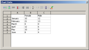
- Right-click on the chart. In the menu, click Chart Data
- Enter the information from the table in the datasheet provide. Note that you might need to add rows and columns
- Click on
 to update the chart
- Close the Chart Data window. When you are prompted to Save click on Yes to save the data. Now the chart is updated with the figures
Changing the Chart Display
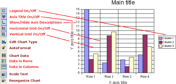
There are a number of buttons along the left margin that control the on/off display of certain features of the chart, like the presence or absence of a legend, axis title, axis descriptions, horizontal grid, vertical grid, as well as the option to show data in columns or rows.
To change the chart display:
- Display the slide that contains the chart that you want to edit
- Click to select the chart that you want to edit
- Click on any of the desired buttons along the left margin to turn a function on or off
Changing the Chart Title
With Impress, you can change the Chart Title at any time to accurately represent the data that is in your chart. To change the chart title on the chart:
- Display the slide that contains the chart that you want to edit
- Double-click the chart to select it for editing
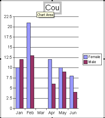
- Double-click the Chart Title to select it for editing
- Type any changes that you want to make to the chart title
- Click anywhere outside of the title to apply your changes
Choosing a Different Chart Type
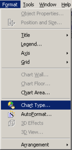
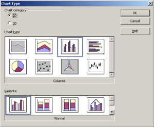
If you don't want to use the chart that automatically appears when you double click the chart icon in a slide, you can choose a different chart type. To choose a different chart option:
- Display the slide that contains the chart that you want to edit
- Double-click the chart to select it for editing
- Click to select a new Chart Type and new chart Variant in the Chart Type dialogue box
- Click the OK button. The new chart replaces the chart that you selected to change

