The element of value or tone
| Art Appreciation and Techniques (#ART100) | |
|---|---|
| The visual language: Artistic elements | Overview | Introduction | Point | Line | Shape | Mass | Space | Value or tone | Color | Texture | Summary |
Value is the relative lightness or darkness of a shape in relation to another. The value scale, bounded on one end by pure white and on the other by black, and in between a series of progressively darker shades of grey, gives an artist the tools to make these transformations. The value scale below shows the standard variations in tones. Values near the lighter end of the spectrum are termed high-keyed, those on the darker end are low-keyed.
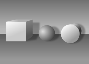
In two dimensions, the use of value gives a shape the illusion of mass and lends an entire composition a sense of light and shadow. The two examples below show the effect value has on changing a shape to a form.
File:ART 2D FORM.png Oliver Harrison, Two-dimensional shapes |
This same technique brings to life what begins as a simple line drawing of a young man’s head in Michelangelo’s Head of a Youth and a Right Hand from 1508. Shading is created with line (refer to our discussion of line earlier in this unit) or tones created with a pencil. Artists vary the tones by the amount of resistance they use between the pencil and the paper they’re drawing on. A drawing pencil’s leads vary in hardness, each one giving a different tone than another. Washes of ink or color create values determined by the amount of water the medium is dissolved into.

