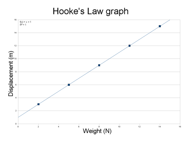
Example Figure
The figure below was created in Open Office using junk data and the procedure in this page below the graph.
Follow the procedure to create your graph once enough participants have completed their row in the data table .
Creating an XY scatter plot in Open Office Calc for upload to WikiEducator
 Activity Activity
|
- Copy data and heading from the data table in the wiki while you are in the 'edit mode
- Open Open Office Calc
- Choose Paste Special -> unformatted text
- Uncheck Separated by tab checkbox
- Check Separated by comma checkbox
- Click ok if things are looking good
- Highlight data and headings in columns 2 and 3 only
|
|
| You only need to highlight columns 2 and 3 for this graph. If you happen to highlight all three columns you will need to change the data series manually.
|
- Go to the Insert menu and click Chart
- Choose XY scatter for the chart type
- Click Next
- Click Next for data range
|
|
| You may want to verify that the First row as label box is checked.
|
- Click Next for data series
- Add a title
- Add an X-axis label
- Add a Y-axis label
- Uncheck Display legend
- Click Finish
- Click on Data points so they are highlighted
- Right click in graph area and choose Insert trend line
- Choose Type tab
- Confirm the trend line type is linear
- Check Show equation and Show R2 boxes
- Click OK
- Move the chart so that it is locked(you should see the anchor symbol) and highlighted
- Copy chart
- Open Open Office Impress
- Choose empty presentation
- Choose Paste Special -> Star Object Descriptor (XML)
- Resize chart
- Export as a portable network graphics (.png) image to your local computer
- Upload the file to WikiEducator
- Add chart to the Analysis page.
|
|
|

