Customising the look of a chart
Having created a chart, Excel provides many options for changing the way it looks.
Activity
|
Please note: the following link will open in a new window/tab. When you have finished, simply close the window/tab and you'll return to this page.
You might also like to check out the relevant sections of the video on page 2.
|
Let's apply this to our chart from the previous section:
Activity
- Click on your chart: you should see the Chart Tools tab at the top of the screen. Click on the Design tab
- We are interested in the Chart Styles group: expand out the chart styles menu. Choose a style on the screen and click it. What happens to your chart?
We can change the layout of our chart too.
- Click on the chart, then on Chart Tools > Layout. The groups that we are interested in are the Labels group.
- Chart Title
- Allows you to make a heading for your chart
- Axis Titles
- Add titles to the horizontal and vertical axis of your chart
- Legend
- Displays a key on your chart telling your users which colours apply to the data in your sheet
- Data Labels
- Places small headings above columns in your chart
- Data Table
- Displays the chart source data underneath your chart.
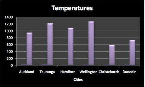
We want to:
- Remove the Legend
- Add a title to our chart 'Temperatures
- Add a title to the horizontal axis labelled Cities
- Click in the chart
- Click Chart Tools > Layout > Labels > Legend > None
- Click Chart Tools > Layout > Labels > Chart Title > Above Chart. Type in Temperatures for our heading.
- Click Chart Tools > Layout > Labels > Axis Titles > Primary Horizontal Axis Title > Title Below Axis. Type in Cities.
- Change the Chart style to something different. You can choose.
- Save your spreadsheet.

Can you spot the mistake?
|
Selecting a non-consecutive range
There are times where we cannot simply click-and-drag a range to use for our chart.
Activity
|
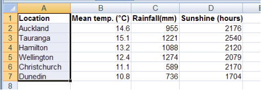
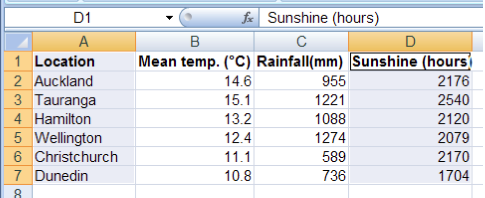
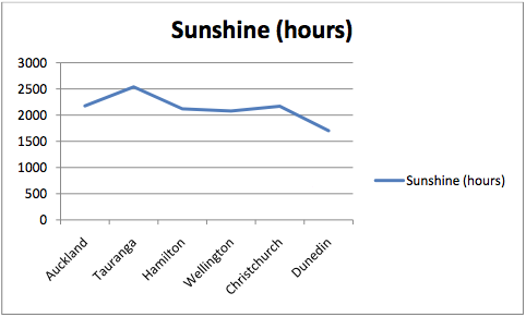
We would like to create a chart that shows only sunshine hours for each city.
- Firstly, select the range A1:A7. This gives us the labels for our chart.

(Let go of the mouse button, as you would normally.)
- Press and hold the Ctrl key on the keyboard – don’t let go.
- Select D1:D7. You will now have two highlighted columns on the screen.

- Let go of the Ctrl key but do not click inside the spreadsheet! If you do, you will lose your selections - if this happens, go back to step 1.
- Click on the Insert Tab and add a 2-D line chart

One of the things that we can see from this chart, is that as you go south from Auckland, sunshine hours tend to trend downward.
Save your spreadsheet.
|
Activity
|
Please note: the following link will open in a new window/tab. When you have finished, simply close the window/tab and you'll return to this page.
You might also like to check out the relevant sections of the video on page 2.
|
Displaying a chart in its own sheet
Now let's apply what we have learned to the bookshop spreadsheet.
Activity
|
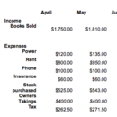
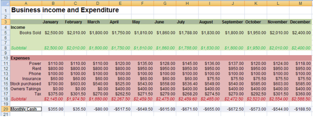
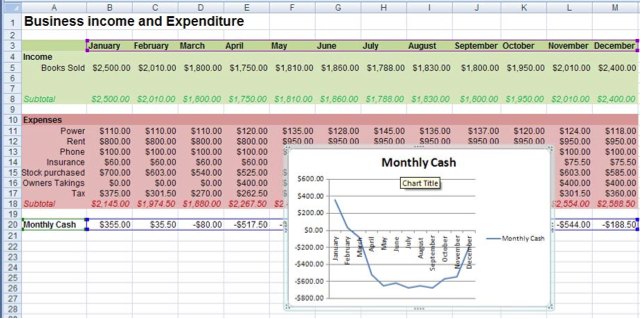
Mr Mann would like to chart his monthly cash in hand to see if there are trends in his income.
- Open the bookshop spreadsheet. Highlight the headings for the months – A3:M3.
- Control-Left-Click and highlight the range A20:M20

- Insert a 2-D Line Chart.

As the chart is rather small to look at, we are going to display it in its own sheet.
- Right click on the chart border.
- From the drop down menu that appears, choose Move Chart.
- From the dialogue box that appears choose New Sheet.
|
Summary
You have:
- Chosen data ranges to make a chart
- Created two different types of chart
- Customised a chart including colour, layout and titles
- Moved a chart to its own sheet

|


