Researching and Presenting Data/Planning/Design
| Researching and Presenting Data | |
|---|---|
| Planning a presentation | Introduction | Purpose and method | Target audience | Design a presentation | Collecting data | Storyboards | Key points | Assessment |
Contents
Designing a Presentation
Once you have all your information you then need to consider how you are going to design your presentation; how you want it to appear. We will use story boards to design our presentations; the story board includes the placement and/or content of text and graphics, font style, size and colour and templates to be used.
What do I want the presentation to look like?
Outline formatting, attractiveness, readability, appropriateness for target audience to be used Decide on font type, size or colour, transitions, slide layout (you can add this to the plan at this stage and then change your plan later if you change your formatting)
Design Tips
Use contrasting colours for the text and the background. Light coloured text eg. yellow or white against a dark background eg. Purple or blue have been researched as the most effective colour for a background. The contrast makes the text easy to read.
Use a font size large enough to be seen from the back of the room where the presentation will be held.
Keep text simple and easy to read by not using many different text effects such as bold, italics, underlining, larger font size for emphasis within a sentence, or different fonts all on the same slide.
Check Spelling and Grammar – all the audience will see on the slide is THAT MISTAKE.
Use bullet points, short phrases and sentences to convey your message. Talk to your bullet points when presenting – remember – “The most common complaint of audiences about PowerPoint presentations is that the slides are loaded with text and the presenter simply reads their slides to the audience”
Only use graphics if they ADD to the message. If they don’t ADD to the message they DETRACT from the message.
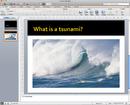
Describing a place or event – then try showing a picture of the place/event with a caption highlighting your key information then talk to the picture in your presentation. Pictures involve emotions and the audience becomes involved more through emotions than text.
Charts - consider if a chart would better highlight the point you are making. Are you showing a trend? Are you showing a comparison between two data sets? Take your numeric data into Excel and create a relevant chart. If you include text on the chart to highlight the key point of the chart then the audience will focus faster and understand the relevance of your numeric data.
Your slide transition effect should be simple and consistent. Different transitions will distract your audience from the subject of the presentation Remember your purpose, topic and audience when creating the PowerPoint presentation Finally, avoid cluttering the slides with too much text or too many graphics. Your audience should hear what you have to say and not be distracted by a busy screen – PowerPoint is a visual AID to your presentation. Focus on the content, not the look.
|
Please note: the following links will open in a new window/tab. When you have finished, simply close the window/tab and you'll return to this page.
|

