Pictograph

This glossary is far from complete. We are constantly adding math terms.
For instructions on adding new terms, please refer to Math Glossary Main Page
Pictograph
|
Contents
Examples
Row-based pictograph
A group of children wanted to compare the number of non-fiction books that they had each read during the winter. They decided to graph their result. Each ![]() represents one book read.
represents one book read.
| Ren | |
|||||||
| Pedro | |
|||||||
| Lisa | |
|||||||
| Tania | |
|||||||
| Sahil | |
Stacked pictograph
Still looking for an example....
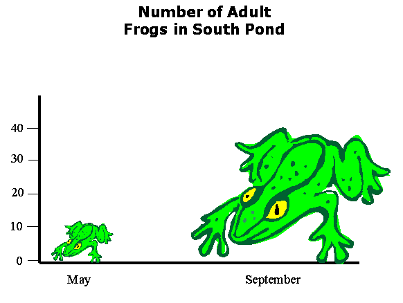
Different-sized images can lead to inaccurate interpretations
The number of frogs in South Pond were counted in May and Sept of the same year. Instead of a plain bar graph or pie chart, it may be tempting to use meaningful images in a pictograph to display the data.
http://www.physics.csbsju.edu/stats/frog.worst.gif
Examining just the height of the two frogs, there appear to be a bit more than [math]10\ [/math] frogs in May and something like [math]40\ [/math] frogs in September. (If it's possible to be more precise, [math]11.6\ [/math] frogs in May and [math]38.2\ [/math] frogs in September.) Just looking at the illustration without noting the title, one might conclude that frogs are simply bigger in September as compared to May.... Although the title says that the graph displays the number of frogs, the graph still leaves the impression of a pretty big difference, because the viewer attends to the area of the image, not just the height.
The frog on the right is a little more than [math]3\ [/math] times longer and [math]3\ [/math] times wider than the frog on the left, occupying [math]3^2=9\ [/math] times more area (and given the 3D presentation, the eye may attend to the [math]3^3=27\ [/math] times more mass and volume). Thus this sort of diagram leaves the viewer with a distorted view of the actual data: a change much larger than a factor of [math]3\ [/math].
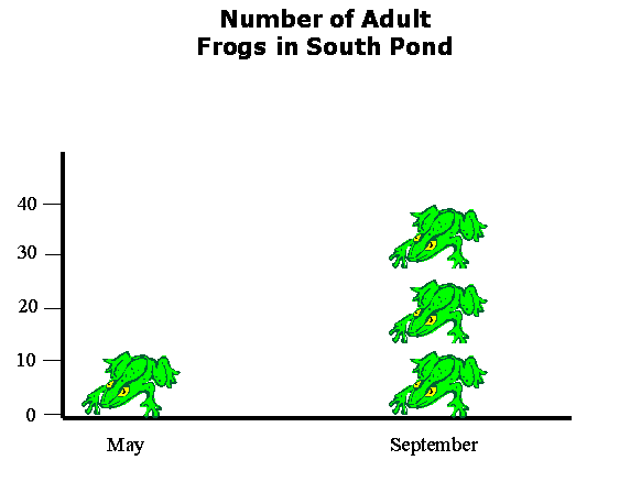
These problems do not arise in pictographs that use an image to represent a standard amount, as evidenced by this "stacked-frog" graph:
http://www.physics.csbsju.edu/stats/frog.bad.gif
Now it is clear that there were something like 3 times more frogs in September than in May. Of course, it is unlikely to have been exactly 3 times more frogs... a confusing fractional frog will generally be required.[1]
Notes
- ↑ Kirkman, T.W. (1996). Display of Statistical Data. Statistics to Use. Retrieved on 2009-02-15.