Desktop publishing/Project 1/Plan
| Desktop publishing | |
|---|---|
| Project 1 | Introduction | Plan | Create | Evaluate | Key points | Assessment |
Contents
Scenario
You are going to advertise your apartment for rent by producing a flyer to put on the noticeboards at Otago Polytechnic and at your local supermarket.
The flyer needs to have “tear off” slips so that people can give you a call to view the apartment. The tear off slips must include your name and phone number.
There need to be 3 clip art images included as a picture strip at the top of the flyer.
The flyer is to be printed on pale blue paper so please allow for this when looking at your colour scheme.
The fonts Arial, Papyrus and Bradley Hand are the ones you can use. Please use one font for the main heading and date available, another for the bulleted list, another for the rest of the flyer. Choose font sizes for each part to make the flyer legible (eg main heading can be seen from a metre away).
The flyer needs to include the following information about the apartment as bulleted items:
|
Written plan
From the information above, we are able to first create a written publication plan. Remember that the plan is a working document, so details can be added and changed as we go.
|
Visual plan
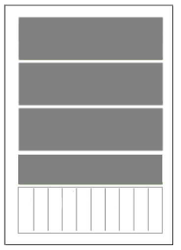
Let's see how the page layout might look as a visual plan:
Take a moment to consider this basic layout in terms of what we covered in Unit 1 - think about the size, position and 'visual weight' of the elements.
Remember that each element may or may not be an actual 'box' in the finished publication - an edge may be a single line or just the edge of text within the elements.
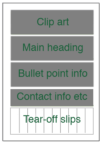
Let's add labels to see how the various items of content might be placed within the elements:
Remember from our brief that having a clip art block at the top was a requirement.
In the next section, we'll go through the steps of creating this publication in MS Publisher.


