VirtualMV/Multimedia/Design/Storyboard/Content
Overview
By the end of this page you will be able to:
|
A storyboard is a graphical representation of the proposed multimedia project (the plan). Just as an architect draws plans for a house giving all the components, a multimedia production requires a storyboard. My thanks to students who have kindly given me permission to include samples of their work.
Benefits
- They’re easy to create - can use pencil & paper
- Allow the designer to anticipate problems
- Serve as a common reference point for design teams and clients, providing firm specifications for both.
- Becomes the "Contract" document between you and your client, and places a boundary on your presentation. This is *important since multimedia production can lead to forever changing specifications.
- Becomes the working document for the multimedia project team.
A building analogy
Most of us are familiar with the way a building is designed and constructed.
- A client visits an architect to discuss the concept. The architect draws concept plans, which are modified with the client until the basic structure is determined
- The architect then produces detailed plans (usually left to a draughtsperson).
- These are then approved by the client
- If the plans are for large buildings, the items that make up the building are put into a Schedule of Quantities (by a Quantity Surveyor), so that all quotes for the building are based on the same information.
- The plans are then priced (usually by several building contractors)
- A price is selected and the building built.
Parts of a storyboard
- Overview of production (Design brief)
- Client requirements & user definition
- What is purpose of the site from the client's perspective
- Target audience
- Defining the needs of the user will focus the design.
- Concept plans
- Sample designs that are used to form the basis of the look and feel of the web site. These should be of an informational page rather than the home page.
- Navigation links:
- A single page showing how the scenes are connected.
- Should indicate the triggers that connect the scenes (eg. buttons).
- The template/standards
- To enable the production to have a consistent feel, it should be based around a template.
- This would commonly be a single page, giving;
- a generic scene (indicates production size eg. 640x480, etc)
- technical details of the generic elements (such as images, sounds, etc.)
- The scene and element detail.
- Commonly a single page that indicates;
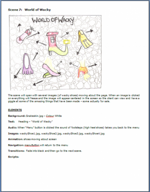
- the scene. A sketch showing the placement of the images and their interaction with each other (see Myst diagram right)
- a description of the elements - content, placement, size, etc. (arranged so that they can be easily sorted by the respective developers)
- A description of any technical details if they vary from the generic.(eg. Colours (eg. 256/16 million, type (for sound mono/stereo, ..),etc)
- a description of transitions to/from the scene
- a description of an animation effects for the cast.
- The element schedule
- Used by the element creators it is an index by element type
Overview of production/Design brief
A brief description of what the site/multimedia presentation is about. This will give the rest of the storyboard a context.
Client requirements and User definition
What is the purpose of the web site - from the client's perspective?
- To inform?
- To entertain?
- eBusiness?
Target audience
Identify some of the following:
- The age range
- Designed for children, teens, adults
- Gender (If appropriate)
- Site for Car Parts, Women's Shoes, etc
- Ethnicity/Culture/Language/Gender
- Is your site for an international audience?
- Will you need to handle multiple languages?
- Level of computer experience
- Technical site on Computing Hardware, Children's gaming site
- What interest areas you would expect visitors/users to have.
- E.g. Interest in sports, collecting, trains, cooking, etc...
- Devices used to view site
- E.g. ePad, Mobile phone
And for each identify what should be done to address these needs. --vmvadmin 17:47, 21 August 2011 (EDT)
Answer the following questions:
- Why would someone want to visit my site, or use my multimedia application?
- Why would someone want to revisit the site or the multimedia application?
- How can the site/application be future proofed?
Concept plans
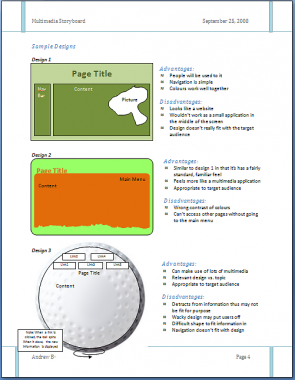
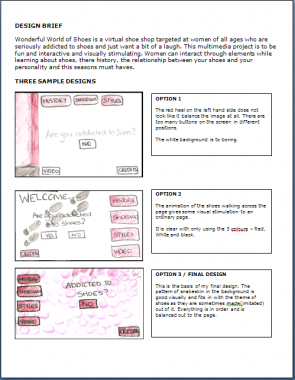
Several layouts should be drawn first. These should explore different possibilities. These may be referred to as scamps.
For each design
- Two samples should be provided:
- A sketch of the introduction/splash page, and
- A sketch of an informational/detail page
- A list of the advantages of the layout (what you like about it). You should also indicate which is the preferred layout.
- A list of disadvantages of the layout
From the options drawn one will be chosen (or a composite) as the primary layout for the web site.
Remember for a web site there are two "users"
- The client for whom the site is being built and
- The eventual users of the site.
Research
Look at existing sites on the same or similar topics. Discuss the advantages and disadvantages of the approach taken. Consider what will make your site more appealing than the ones found.
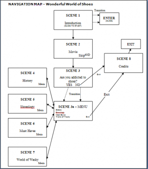
In order to show how pages (in html) or scenes (in multimedia) link a navigation map can be used. The navigation map is a document that shows the relationship between the scenes/pages in a multimedia/web presentation (It is equivalent to an Entity relationship diagram in a database).
Multimedia
Internet
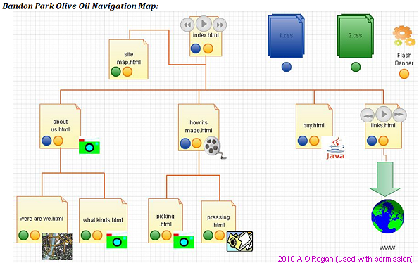
The following navigation map was drawn using a demonstration version of creately (http://creately.com/ - Used with permission Ash 20:55, 12 October 2010 (UTC))
The following navigation maps show a No-frames based site (left) converted to a frames/no frames site (right) - click to enlarge the images
Quick Tours of Hawkes Bay: Web site Navigation map Quick Tours of Hawkes Bay: Web site Frame/noFrame Navigation map
Ensure that the navigation map:
- Has intuitive navigation (linking direction clear )
- is on a single page (as far as possible)
- Has a title.
For a multimedia navigation map:
- Clearly indicate which is the start scene, navigation between the pages shown and any external links.
For a Web Navigation map include:
- Logical first page (usually index.html or default.htm)
- If frames, clearly show pages
- Pages with html name
- A page description (if the page name is abbreviated or unclear)
- a site map page (a page that links to all pages). If you use frames the site map can be the alternative no frames page.
- a web links page (may also contain a bibliography)
There are several ways to organise the flow of a multimedia application.
- Linear List
- Commonly used in presentation programs such as Powerpoint, where the user clicks the mouse to activate the next object (slide, animation, etc)
- Menus
- The user is provided with a set of choices. These may be presented as hyperlinks, or pictures. Configuring a game is commonly done by using menus.
- Hierarchy
- Each object provides a menu of choices. Examples include trouble shooting guides (e.g. Hewlett-Packard printers)
- Network
- Objects are linked in multiple directions. Multimedia games use this extensively.
- Hybrid
- A combination of all or some of the other four types. The most obvious example is the World Wide Web.
- Database
- A database is a "random" collection of objects that are accessed via a search engine.
- Suggested Applications:
Template/standards
This is a model (or template) for all other pages, so a sample page should be carefully drawn. It sets the standard for backgrounds, fonts, colours, balance, screen size, and so forth.
This is the tool that will give your presentation the professional feel, and should be stabilised and agreed to before the presentation/site is constructed.
Example properties that should be discussed;
- Screen size (recommend 800 x 600 pixels, 1024x768 is the current standard screen size)
- Default colours
- Text font, size
- Any standards for elements (e.g. sounds = wav )
- A prototype page (Without all the effects). This should give a user an impression of a typical page in the project (not just a menu page).
- Suggested Application:
- Pencil & paper for prototype.
- Word or Powerpoint,
- Drawing program (Corel Draw, PaintShop Pro, or similar)
For a web site this is used to develop the CSS, so
- Identify the size of screen you are developing for: e.g. 800 x 600.
- Sketch the basic outline including headings, buttons, logos, backgrounds etc that are common on all pages then
- identify things you could put a css. For example h1 = Blue, Arial, etc.. h2 = ...
Scene and element detail
This is a single page that describes an individual scene/page. It must have enough detail so that if several people used this design, they should come up with the same result.
One page for each scene showing layout, media interaction, and transition effects. The content of elements needs to be clear, for example, pictures should be sketched, text content indicated.
Each page should have consistent screen navigation links, and follow the generic template.
Scenes that should be included.
- Introductory
- A Bibliography/Reference page.
- Credits page.
- On each page:
- A way of returning home (this may be the back button)
- An indication of where the page sits in relation to the entire site.
- Things to consider
- Balance, buttons give feedback, subliminal meaning (e.g. colour can have different connotations - in Spain Black can be used for a wedding).
For a Web site pages that should be included:
- index.html = the start page
- A site map = A non-frame page linking to all the pages in your site.
- A Bibliography/Reference page.
- A WWW directory/hot link page.
On each page:
- A way of returning home (this may be the back button)
- An indication of where the page sits in relation to the entire site.
- Suggested application(s):
- Pencil & paper !. A suitable template can be created in Word or PowerPoint.
Element schedule
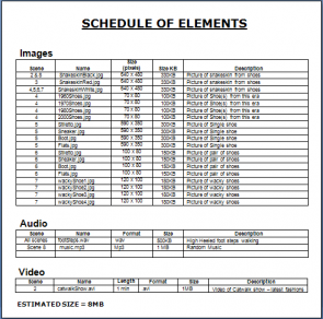
This is a list of all of the multimedia elements to be used in your presentation. It should be sorted by type (text, graphics, animation, sound, video) to be used by element creators.
This equates to a house Schedule of Quantities, where it is a list of elements to get for your house (doors, windows, timber, etc. ).
These elements commonly are gathered or created by specialists e.g. a video specialist.
- Suggested application:
- MS-Excel
The detail required is enough so that for example a photographer could take the list and gather images ready for inclusion into the multimedia presentation. Things to include;
- Pages that element appears
- Description (on a web site this would be used for the alt tag)
- Filename,
- Filetype/Format,
- Physical dimensions (height x width, duration (audio/video))
- Estimated size (on disk)- these are estimates
- Any special requirements
For example
- Text (Description, Scene, Technical (Font, Size, Type) )
- Graphic (Filename, Scene, Description, Size (Bytes, pixels), Technical (Internal/External, Features (looped?))
- (Include any text as graphic elements here)
- Gif sizes 300x200 approx 90K, 640x480 approx 180K
| Filename | Page Ref | Descrip | width x h(px) | Size (KB) | Comments |
| splash.png | 1, 5 | Splash logo | 200x100 | 12 | keep light and mainly green |
- Animation ( Filename, Scene, Description, Size (Bytes, pixels), Technical (Internal/External, Features (looped?))
- Audio ( Filename, Scene, Description, Size (Bytes, length), Technical (Internal/External, Features (looped?))
- WAV: Allow 12MB per minute
- MP3: Allow 1MB per minute
- MIDI: 6K per minute
- Video ( Filename, Scene, Description, Size (Bytes, length), Technical (Internal/External, Features (looped?))
- AVI: 160x120 allow 1MB per second
- MPEG: 160 x 120, allow 150k per second
- Interactive elements (Javascripts, DHTML, associated programs - .exe files)
Notes
- Include a total size estimate. This will give an indication that the presentation is feasible. E.g. for CD-ROM < 640 MB, and for a Web site an indication of how much disk space will be required on the Web Host.
- Avoid using vague filenames e.g. image1.png, image2.png. They don't give any idea of what the file contains and don't scale well (if you increased the number of images say to 100 you may have to search them all to find the one you want).
Tips
If you scan drawn images of your storyboard into a Word document you may find you have created a monster file. Word 2007 has a picture compress facility that will dramatically reduce the document size. Also including PowerPoint slides can cause size issues. Link to the picture compress page for details
Warning ** if you create your storyboard in PowerPoint and create a Word document that is huge, it may be that every image is actually the PowerPoint. So, you can save the PowerPoint slides as images, or use print Screen and paste into Word..
For more information go to MS-Word2007: Compressing Pictures
Sample storyboards
The following pages give (reduced) samples of storyboards which students have kindly given me permission to include in the wiki. (If you are a student listed - and your pages are not included yet - and are happy for them to be added could you add four squiggles ( ~~~~ ) to the end of the line).
Multimedia
- 2008: Wonderful world of shoes by S. Porter
- 2009: Going to the Chatham Islands by S. Day
- 2009: Pirates by D. Richardson
- 2010: Gruesome Manor by Lync27 04:10, 1 December 2010 (UTC)
- 2010: The circus by D. Plimmer - Dplimmer 21:47, 2 December 2010 (UTC)
- 2011: Casino by R. Waikato
- 2011: Farming by R. BradyRobynB 21:39, 13 February 2012 (EST)RobynB 05:29, 8 March 2012 (EST)
Internet
- 2008: Swim School by S. Porter
- 2009: One Day Walks by S. Day
- 2009: History of Medicine by L. Corner
- 2009: Oral language Resource by G. Hall Hallg3 22:18, 4 May 2011 (EDT)
- 2010: Belle Florist by Sam 20:58, 12 October 2010 (UTC)
- 2010: WIT - Whatever it takes by Katja1983wi 02:42, 12 October 2010 (UTC)
- 2010: Greek Mythology by T. Carpenter
- 2011: DevonRex Cats by Sam - Sam 16:45, 2 May 2011 (EDT)
Other resources
Cite error: <ref> tags exist, but no <references/> tag was found
