Creating a histogram in OpenOffice Calc
A histogram is a graphical tool used to visually display a collection of data. A histogram is appropriate for use with data values on a continuous scale (also called interval or quantitative scale). The following instructions are written as a "follow along" exercise, using a dataset available for download.
Contents
Example scenario: Old Faithful geyser eruptions
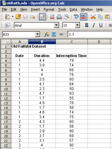
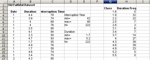
Old Faithful is a geyser in Yellowstone National Park in Wyoming, USA. To better understand the timing of the eruptions, the duration of the eruptions and the time since the previous eruption were measured over 23 consecutive days. The Old Faithful dataset contains 222 observations, including date of observation, duration of the eruption and the time since the previous eruption. A histogram of the duration of eruption will provide a graphical display showing the distribution (shape) of the data. Use the following instructions to create such a histogram.
Prepare the data
Download the Old Faithful dataset by choosing the "red dot" (Excel) version. Open the dataset with scalc.exe (the OpenOffice spreadsheet application).
Define the histogram's class interval
The class interval specifies the range of values to include in each bar of the histogram. The interval must be the same for all bars.
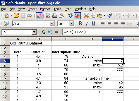
In unused cells to the right of the data, enter the formulas for min, max and count. These values are needed to determine the number and size of the classes.
The Rice Rule with 222 observations yields 12 classes. Choose a starting value that is equal to or slightly less than the lowest value.[1] In this example set the starting value just below the minimum duration, 1.6. Calculate the size of the class interval by dividing the difference between the max and min by the number of class intervals. In this case, [math]\frac{5.2-1.7}{12}=.29\,[/math], which rounds to [math].3\,[/math].
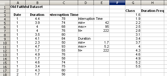
With a starting value of 1.6, a max of 5.2, and a class size of .3, the upper threshold for each class will be 1.9, 2.2, 2.5, ... 5.2. Lower limits are not needed when using the OpenOffice FREQUENCY function. Adding an additional class above and below the extreme values will visually suggest that all of the sample data is included.
- In one of the columns near the data, enter these numbers: 1.6, 1.9, 2.2, 2.5, ... 5.2, 5.5.
Calculate the frequencies in each class interval
The frequency count in each class can be automatically counted using the FREQUENCY function in OpenOffice. The FREQUENCY function is an array function, returning values to a range of cells.
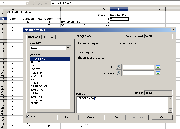
- Hightlight the range of cells in the column adjacent to the class intervals, labeled "Duration Freq."
- Choose Insert > Function.
- Scroll down the list of functions to select FREQUENCY.
- Click on Next>>.
The Function Wizard will display. The FREQUENCY function requires two arguments: data and classes.
- Click on the shrink button,
 , next to the data field.
- Highlight the cell range which contains the data.
- Click the maximize button,
 , to return to the full dialog box.
- Use the same procedure to fill in the range for the classes.
The completed formula will display in the formula bar.
- Click OK.
The frequencies for each class interval display in the cells adjacent to the class limits.
Create the histogram
- Select Insert > Chart....
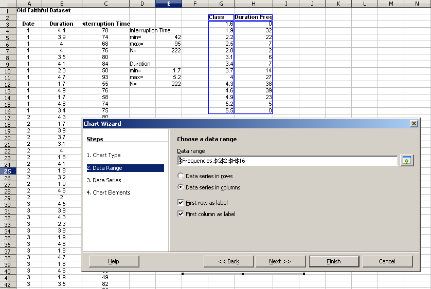
The Chart Wizard dialog box opens.
- For 1. Chart Type, select Column.
- Click on Next>>.
- For 2. Data Range, click on the shrink button,
 .
.
- Highlight the full range of classes and frequencies.
- Check the box "First column as label", so the class levels are used as labels for the x-axis.
- If you include the header labels, check the box "First row as label."
- Click on Next>>.
No revisions are necessary on 3. Data Series.
- Click on Next>>.
- For 4. Chart Elements, enter a title, labels for the x and y axes, uncheck "Display grids" and uncheck "Display legend." *Click Finish.
The chart is inserted into the open sheet.
- To remove the space between the bars, as required for a histogram, double click on the graph to enter edit mode, right click on the bars and choose Object Properties....
- Choose the Options tab
- Set the "Spacing" under "Settings" to 0%.
- Click OK.
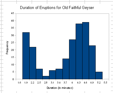
The histogram displays.
The histogram clearly indicates that the duration data are bimodal with one mode near 1.9 minutes and a second mode near 4.6 minutes.
Notes
- ↑ An alternative approach is offered by the author's of Collaborative Statistics (2. Descriptive Statistics, Histograms) who recommend a starting value carried out to one more decimal place than the data point with the most decimal values.
