Histogram
From WikiEducator
This glossary is far from complete. We are constantly adding math terms.
For instructions on adding new terms, please refer to Math Glossary Main Page
Histogram
|
Tip: When creating a histogram...
- Leave no space between bars when the class intervals represent continuous data; bar graphs, drawn with a gap between bars, are used to represent discrete data (i.e., different categories).
- Graph the observed frequency in each class interval (also called the class frequency) for datasets with a small to medium number of observations; label the y-axis "Frequency." Graph the relative frequency in each class interval for datasets with a large number of observations; label the y-axis "Proportion" or "Relative Frequency."
Contents
Examples
A typical histogram
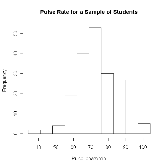
Pulse rates, in beats per minute, were calculated for 192 students enrolled in a statistics course at the University of Adelaide.[1] The first step in creating a histogram is to create a frequency table.
| Pulse Rate | Count |
|---|---|
| (34-41] | 2 |
| (41-48] | 2 |
| (48-55] | 4 |
| (55-62] | 19 |
| (62-69] | 40 |
| (69-76] | 53 |
| (76-83] | 30 |
| (83-90] | 27 |
| (90-97] | 10 |
| (97-104] | 5 |
| Total | 192 |
Using the class frequencies (the number of observations in each class interval) shown in the frequency table, the following histogram was created.[2]
Exploring the effect of class interval size
See West's histogram applet for an opportunity to experiment with different class interval sizes.

