Course site design project
|
- Request for quotations
- newSpash commissioned for this project.
- OCL4Ed14.06 Demo prototype using Bootstrap
Contents
Initial design concept (Landing page)
Design rationale from newSpash
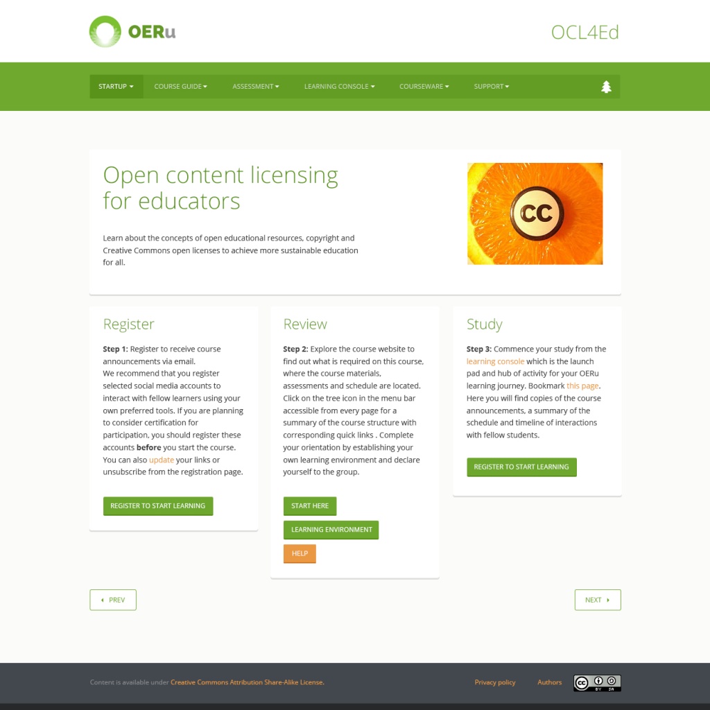
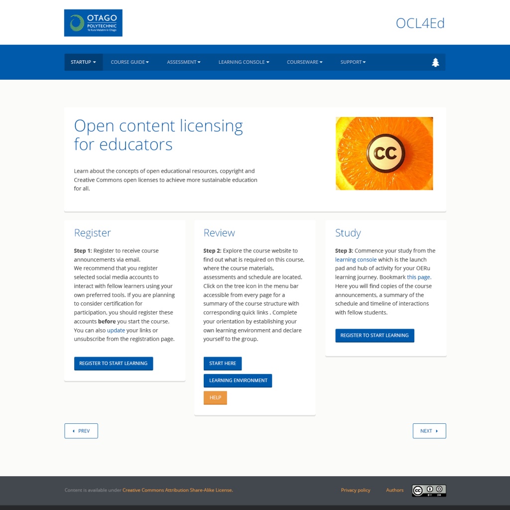
Two page layouts have been developed. One is based on the OERu website, the other is based on the OERu partner Otago Polytechnic and its visual identity. These are designed to be implemented through the Bootstrap framework.
The design was inspired by the original OERu website and the design choices Google has taken when implementing their web based apps. The design is predominantly flat with subtle tiles to help show hierarchy with the content.
Each section of information is nested within a subtle tile, this is to help separate the content into bite sized chunks the user can read, understand, and move on without getting lost. We have used Open Sans as the main font because of its easy to read, friendly appearance, and its strong connection to the current OERu identity. Buttons are also based on the current OERu styling, while the previous and next buttons having a unique appearance so the user can easily identify them.
The colour palette is based on the provider publishing the course, while help or attention links and outside of course links are currently orange – and will be easily themeable.
OERu landing page theme
| Click on arrow to view example layout |
|---|
Otago Polytechnic landing page theme
| Click on arrow to view example layout |
|---|
Feedback on landing page theme concept
- Drawing on experience using the prototype and web statistics, recommend conserving real estate in the main menu navigation moving the support link into a footer implementation. (Support pages were by far the least used links) --Mackiwg 01:59, 15 July 2014 (UTC)
- Possible implementation for support links in the footer bar: Have three headings with subpage links listed below, for example:
- Support (with sub links for FAQs, Tips)
- Help tutorials (with sub links, for example Microblogging, Blogging)
- Related courses (with sub links to the other associate micro-courses in the group required for credit for the elective)--Mackiwg 02:07, 15 July 2014 (UTC).
- Where would a user/profile (login) link be accommodated in the design?
- I would like to see a space provided in the design for the name and logo of the Uni who is presenting the course, and the name/s of the presenters.Slambert 02:27, 25 July 2014 (UTC)
- The main OERu website lists the partner institution who contributed the course, and individual partners will have the freedom to use their own branded theme where the partner logo is displayed, see for example the Otago Poly theme above. So this is already accommodated --Mackiwg 02:32, 25 July 2014 (UTC)
- Would/could there be any dynamic content such as the number of people enrolled in the course, twitter stream?Slambert 02:27, 25 July 2014 (UTC)
- As in the case of OCL4Ed, we have a participants page as an option under the Learning console link. Remember, authors will have the freedom to generate their own labels and positioning of pages within the course outline in the wiki which is used to generate the site navigation. These components are not dictated by the theme --Mackiwg 02:32, 25 July 2014 (UTC)
- The dates that the course is running need to be quite prominent - where do they go in the design?Slambert 02:27, 25 July 2014 (UTC)
- The dates are clearly displayed on the course listings on the main OERu site. Dates can also be incorporated into a schedule page, see for example. Remember that the author controls the text on the pages contained in the course outline, so you could easily display the dates prominently on the landing page. --Mackiwg 02:35, 25 July 2014 (UTC)


