Internet & Web development (2)/Course materials/Overview/Design Components
| Internet & Web development (2) | ||
|---|---|---|
| Overview | Web Browsers | Web Development Ecosystem | Web Page Layout | Design Components ( Design Tips | Accessibility ) | | |
Introduction
Overview
By the end of this overview you will be able to:
|
Overview
Look at what Jacob Nielsen considers good design
- Nielsen, J. (1995) Why No Graphics?. Retrieved from http://www.nngroup.com/articles/why-no-graphics/
- Nielsen, J. (2008) . Top 10 Mistakes in Web Design. Nielsen Norman Group. Retrieved from http://www.nngroup.com/articles/top-10-mistakes-web-design/
For mobile sites
- Google 25 principles of mobile site design (2014). Retrieved from http://www.google.com/think/multiscreen/whitepaper-sitedesign.html
Introduction
In order to create an effective multimedia presentation there are several design components that need to be considered.
- From a client & user level
- Client requirements, User requirements
- From the physical organisation, storage and device level
- Web hosting,
- Folder organisation
- File issues: Name, Number and size
- PC, Laptop, Tablet, Phone
- From the application level
- Navigation, Accessibility
- At a scene / page level.
- Balance, Colour
- At a multimedia element level
- Appropriateness, Size
Client & User Level
When developing a multimedia application, three separate things come into play:
- Client requirements
- Target audience/ user requirements
- Ability and skill set of the designer/developer
Conflicts can occur.
- For example: Client wants green text on red background as it matches corporate image, but makes text difficult to read.
Target audience
Probably the most important factor..questions such as:
- Who are you writing the page for. A young Child, a teen, young adult, older person?
- What is their skill level/interests?
- Are you catering for an International audience (multiple languages, regional variations?)
- ...etc...
Case Study
GoldHomes is a Real Estate Company specialising in house sales. The CEO of GoldHomes has come to you with some fixed ideas for a CD-ROM, formed by viewing those of similar companies. The following are some ideas that you have been told to incorporate (apart from the obvious details of the houses for sale).
- A fine hand written script style font to show their exclusiveness.
- A light green background with gold text, so it gives the CD a clean green image and emphasises the company’s name.
- An animated border so that the CD is eye catching.
- Pictures and descriptions of all houses sold in the past by the company. This is to impress potential buyers with how many houses the company has sold.
- Audio and videos of clients describing their houses.
From research you discovered that the intended audience are;
- Dual income families who are very busy.
- Known that they would probably view the CD after work.
- Are well educated and read quickly.
- Are proficient at using computers.
- Are mainly from all over New Zealand, but could be international.
Some questions?
- For each of the items, explain the impact on the success or otherwise of the Web Site, taking into account the intended audience.
- Explain how a storyboard can help resolve some of the issues.
Additional readings/Resources
- Case-Study: Deconstructing Popular Websites (Opinion Column)[1]
- 40 Must Have Cheat Sheets For Graphic Designers And Developers (Akhter, 2013)[2]
Physical organisation, storage and device level
- Web hosting,
- Folder organisation
- File issues: Name, Number and size
- PC, Laptop, Tablet, Phone
Target device
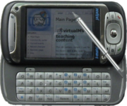
Not all multimedia is displayed on a PC. PDA's and Phones (e.g. iPhones) can also display multimedia presentations.
Personal Digital Assistants (PDA)
In HTML it is recommended that HTML tags are restricted to
- p,br,b,pre,h1-h6,blockquote,center,ul,ol,li,images and tables
Avoid
- Frames, layers, image maps, plugins, JavaScript, Java and CSS.
Resources
- Writing a PDA Friendly web site ( http://webdesign.about.com/cs/pdastheweb/ )
- Designing Web Sites for PDAs ( http://hotwired.lycos.com/webmonkey/99/20/index2a.html?tw=design )
- HTML 4.0 Guidelines for Mobile Access ( http://www.w3.org/TR/NOTE-html40-mobile )
- There is a marked difference between designing web pages for the net and designing pages for the small screens of cell phones, palmtops and PDAs. Simplified HTML programs, small clear graphics, no frames, and drill downs rather than scrolling, all combine to ease the reading and use of a small screen. http://www.avantgo.com
Tablets
Tablets have been labeled as media consumption devices. Watching videos, playing games, browsing the internet are regarded suitable for tablets. So can these gadgets be put to use for heavy-duty working, like web development and designing? Do they have the potential to replace laptops and computers in this field?
Web Development on Tablets – How Apps Have Changed the Game (Web Developer Juice,2011)[3] --Kaijsd1 01:42, 22 August 2011 (EDT)
Application level
From a design view-point you need to consider
- Navigation
- Logical structure
- Buttons in a consistent place
- Location of scene in relation to whole clear
- Indicate when button is pressed
- Accessibility
- Physical structure
- One of the most critical aspects of multimedia design.
- Poor structure and navigation scheme, will confuse users.
- A simple, logical, understandable navigation scheme can increase
- Time that users stay on your presentation and
- Number of times they reuse the presentation.
- Well designed presentations tend to have similar navigation layouts, like most books have a table of contents, page numbers and an index.
- A good technique is to organise you presentation into logical sections and have a list of quick links for experienced users.
- Try to give users a feel for where they are in your presentation, and avoid the feeling that they are lost or buried in your presentation.
- Use standard metaphors to guide them e.g. a home button to go to the start.
Hints
- Head the 3 click rule, should be able to navigate anywhere on your site in 3 clicks (Breadcrumbs is a common technique)
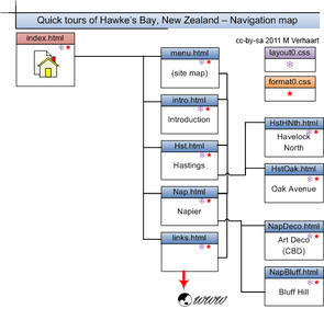
- Provide a site map
- Consider adding a search feature
- Good navigation answers
- Where am I?
- Where was I?
- Where can I go?
Accessibility
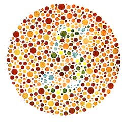
- the degree that multimedia can be accessed by users with
- Disabilities (visual problems (colour blindness,voice readers), to cognitive impairments)
- Different user agents
- desktop browser, voice browser, mobile phone, automobile-based personal computer
- Constraints
- noisy surroundings, under- or over-illuminated rooms, in a hands-free environment, etc
- Slow modems (Web)
For further discussion: Accessibility |
Physical management
- How is the application arranged on disk to assist in ongoing development and maintenance. 1,500 html files in one folder with all the images is a difficult site to manage.
- How are versions managed? Flash versions, html versions and element versions(e.g. images - originals and changes).
- Naming of files - be consistent. Should have logical names to quickly identify content.
- Avoid spaces (prefer CamelCase) - a %20 is placed in a file name in the url of a Web Browser to represent a space.
Compatibility
You should also consider browser issues and how these can be handled
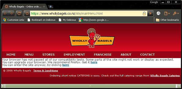
The following screen shot shows how one web site handled browser compatibility (You may like to add some comments)
Source: Wholly Bagels (2008)[4]
comments
- Message should be displayed with the page "You can enter the site anyway, by clicking here".
Scene/Page Level - Layout
For web sites check out
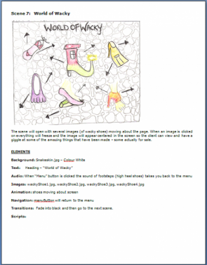
For Flash based sites
|
Layout
A multimedia screen can consist of
- Unstructured elements
- Text, images (including icons), animation, audio and video
- Structured elements
- Flash
- interactive elements
- Buttons
- Controls (volume, sound on/off)
- Hypertext links and triggers (something you click on that causes an event)
So positioning these onto the screen is important. Consideration needs to be made on where would be the best place to put them. Dividing the screen into regions is a simple way to achieve this.
The website http://www.ryerson.ca/dmp/courses/presdesign/part2/ [Broken Link] indicate that the aim of design is to include the composition tangibles (line,shape,volume,texture or colour) and tangible ideas (rhythm, balance,weight, and symmetry) to form harmonious whole.
- Resources
- http://www.smashingmagazine.com/2009/08/05/30-fresh-and-inspirational-portfolios-with-a-twist/
- ‘Destroy The Web 2.0 Look’ @ Future of Web Design, New York . http://elliotjaystocks.com/blog/archive/2007/destroy-the-web-20-look-future-of-web-design-new-york/
Font issues
Fonts need to be clear, so consideration needs to be made for
- Size (too small is too hard to read, too large dominates the presentation)
- Type (Remember not all computers have the same fonts or font names Arial on Windows is Helvetica on the Apple Macintosh. Director allows specialised fonts to be embedded into the projector. Remember also that fonts are subject to copyright and unless embedded are not usually able to be distributed for free. If you need a special font, but are not sure if all target machine will have the font, the text can always be included as an image.
- For the web, use CSS font families. The Code Style font sampler (Shaw, 2009)[9]is a guide to the most common fonts on Windows, Mac and Linux.
Colour combinations (Foreground and Background)
| Background Colour | Recommended Foregrounds | Foregrounds to avoid |
| White | Black, Navy, Red | Yellow, Aqua,Silver |
| Blue | White,Yellow, Aqua | Lime, Black |
| Silver | Black, Navy,Maroon | Lime, Aqua, Yellow |
| Yellow | Red,Blue, Black | White,Aqua |
- Adobe:Kuler (n.d.) [10] ( http://kuler.adobe.com/ )
- kuler is the first web-hosted application from Adobe Labs designed both to stand alone and to complement Adobe® Creative Suite® software. Built using Adobe® Flash® and ActionScript 3.0, kuler is all about color: color for exploration, inspiration, experimentation and sharing.
Background images
Background images can make text very difficult to read. Addin a drop shadow to the text can improve its readibility.
Buttons
- Navigation and usability can be greatly improved if buttons are lined up in a logical order.
- Also avoid having buttons shift position.
- Add icons to buttons to give additional clues to what the button will do (e.g. printer).
- Give text equivalents, in case the iconic representations are unclear and to allow for screen readers to decipher the purpose of the button.
Metaphors
- Use consistent metaphors.
- For example if your topic is on music, try to use musically themed buttons.
- Use familiar metaphors.
- A house is commonly used for the home button, a rubbish bin for delete.
Adopt a common look and feel
Above all keep it simple.
Web Specific considerations
Total Download time
According to Zona Research (2001) in the US, the likelihood of a customer leaving a web site is
- 7% if the page loads under seven seconds
- 30% between 8 and 12 seconds
- 70% over 12 seconds."
Cross browser
- Websites can look completely different on different operating systems, monitors, and browser version. Test in various browsers (IE, Firefox, Chrome, Safari)
Cross platform
- Many web servers run on unix platforms where a file called "Myfile.htm" is not the same as "myfile.htm" or "MYFILE.HTM". This too will result in broken links.
What your web design says about you
What Your Web Design Says About You (Infographic)(Collins, 2010)[11]
Element Level
- Appropriateness
- Does element fit the context?
- Animation: Fits purpose or annoying?
- Size
- Text
- Fonts need to be suitable scaled
- Use Upper and lowercase (including headlines) as you can scan words more quickly than if Uppercase only.
- Use lists as they are very easy to read and are a very powerful way of publishing information, especially for links and menus.
- Images:
- Images should be inserted at the size they will be displayed, not captured at.
- Include thumbnails if you want to display a clear large image - to give the user the choice of whether to download or not.
- High quality - avoid artefacts (speckles) particularly with transparent images (gif files).
- Animation
- Make sure it is appropriate.
- gif (not resized)
- Flash (small size, if wait on load give indication as to how far to go - % loaded). Check for Flash Player (if displayed on the Web) and provide an alternative if possible.
- Audio: Length appropriate. Check for conflicts (that only one play). Make sure you have volume/mute controls as many people listen to music while they use their computers.
- Video: Display duration, size, and height & width. Avoid video on the first page (unless you have a site like YouTube!)
For the Web
- Text: Use style sheets to manage font families as different computers have different fonts.
- Images: Include width and height values as this will improve browser rendering speed.
- Caching and reuse. Reusing images such as logo's will speed page downloads as they are held in the local computers cache.
Quality
Quality needs to be considered from two perspectives
- Design: controlled via a storyboard and feedback from users.
- Technical: controlled by testing and feedback.
Future of Web Design
- Split content from design
- Easier to maintain
- Speeds up design process
- Use XML and XHTML standards
- XHTML/XML formatting
- All tags come in pairs
- Attributes must have values in quotes
- Recommends lowercase tags
- XML will define data structures, content and web objects
- Learn new HTML5 constructs, and JavaScript integration
- Keep up with current trends
- AJAX, Cloud computing (e.g. Google docs, Azure, Xero), Software as a Service (SAAS)
- Be aware of Web 2.0 technologies
- integrating existing media into your site (e.g. YouTube, Flickr)
- Keep track of Web 3.0 technologies
- Semantic web
- Be aware of Mobile technology trends
Further reading/Resources
- What are the important components of a web site or the components of a good website? (Berto, 2006)[12]
- Carman.(n.d). Good Web Site Navigation - Reaching The Information Instantly. Retrieved November 29, 2010, from http://www.mardiros.net/good-navigation.html
- Felke-Morris, T. (n.d.). Web Design Best Practices Checklist. Retrieved November 29, 2010, from http://terrymorris.net/bestpractices/
- Design Skills presentation - G Brown
- Graham J. Brown. Good Design, Poor Design. Created for presentation to DTP students at EIT 22 May 2006
- Download 2006Brown_DesignSkills.pps
- 60 Questions to Consider When Designing a Website (Dawson, 2010)[13]
 References
- ↑ zurb (n.d.) Case-Study: Deconstructing Popular Websites (Opinion Column), Retrieved May 13, 2010 from http://www.smashingmagazine.com/2010/05/12/case-study-deconstructing-popular-websites-opinion-column/
- ↑ Akhter (2013) 40 Must Have Cheat Sheets For Graphic Designers And Developers Retrieved from http://www.smashingapps.com/2013/02/28/40-must-have-cheat-sheets-for-graphic-designers-and-developers.html
- ↑ Web Developer Juice (2011) Web Development on Tablets – How Apps Have Changed the Game. Retrieved from http://www.webdeveloperjuice.com/2011/08/21/web-development-on-tablets-%E2%80%93-how-apps-have-changed-the-game/?utm_source=feedburner&utm_medium=feed&utm_campaign=Feed%3A+WebDeveloperJuice+%28Web+Developer+Juice+-+Jquery%2C+css+%2C+html%2C+ajax+%2Cphp+and+photoshop++tutorials%29
- ↑ Wholly Bagels (2008). Online ordering of short notice CATERING. Retrieved April 18, 2010 from https://www.whollybagels.co.nz/site/mainMenu.html
- ↑ Zen Garden (n.d.) Retrieved August 24, 2009 from http://www.csszengarden.com/
- ↑ Flanders,V. (2009) Web pages that suck. Retrieved August 24, 2009 from http://www.webpagesthatsuck.com/
- ↑ Yulia (n.d.) Retrieved August 24, 2009 from http://yulia.co.nz/Site/YULIA.html
- ↑ Whittaker's Chocolate(n.d.) - Since 1896. Retrieved August 24, 2009 from http://www.whittakers.co.nz/
- ↑ Shaw, P. (2009) CSS font sampler and survey. Retrieved August 30, 2009 from http://www.codestyle.org/css/font-family/
- ↑ Adobe:Kuler (n.d.) Retrieved September 18, 2007 from http://kuler.adobe.com/
- ↑ Collins, D. (2010) What Your Web Design Says About You (Infographic) Retrieved from http://sixrevisions.com/infographics/what-your-web-design-says-about-you-infographic/
- ↑ Berto, T.D. (2006) The important components of every website design. Retrieved from http://www.seowebsitesdesigners.com/designing_websites/website_design_components.html
- ↑ Dawson, A. (2010) 60 Questions to Consider When Designing a Website. Retrieved from http://sixrevisions.com/web_design/60-questions-to-consider-when-designing-a-website/
|
virtualMV | Superquick wiki guide | Please give me some feedback |
Internet & Web development (2)/Course materials/Overview/Design Components. (2024). In WikiEducator/VirtualMV wiki. Retrieved December 22, 2024, from http:https://wikieducator.org/Internet_%26_Web_development_(2)/Course_materials/Overview/Design_Components (zotero)
|
