Embedding a chart into Word
Adding an Excel chart into Word is very similar to adding a table of data. We copy the highlighted table and paste it into word.
Activity
- Open word and create a new blank document.
- Open your spreadsheet Steeplechase_results.xlsx
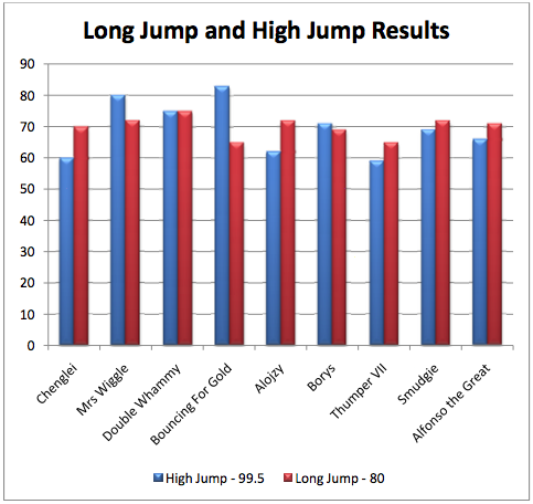
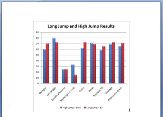
- Using the columns for rabbit name, high jump and long jump, create a clustered column chart as an object in your sheet. Move the legend to underneath the chart and add a chart title above the chart. You should end up with something like this:

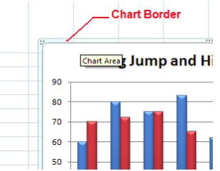
- Select the chart so you can see the chart border:

- Copy the chart.
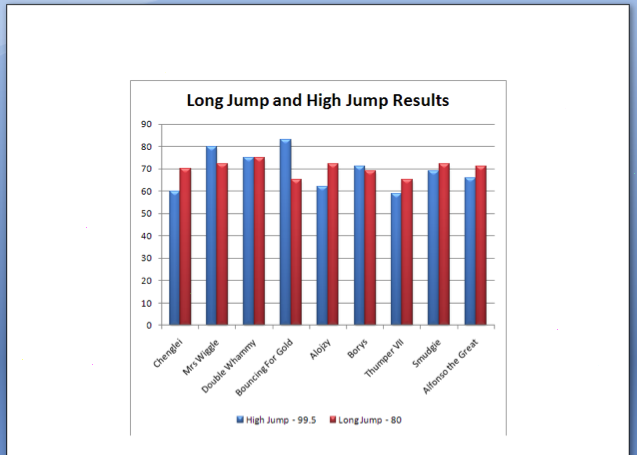
- Switch to your word document and paste the chart into your document.
- Save the Excel file and the word file.
|
Please note
| Remember that if we want to change an embedded chart (for example to change the colour scheme, or if the data has changed) we need to do this in Excel, and re-copy and paste back into word.
|
Linking a chart in Word
We can link to the chart to ensure it updates dynamically when the spreadsheet data changes.
Activity
- Open word and create a new blank document.
- Open your spreadsheet Steeplechase_results.xlsx
- We will reuse the chart we created for the previous exercise. Select the chart. Copy.
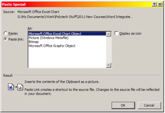
- Go to your word document. Choose paste special. Make sure you choose Micosoft Excel Chart Object from the menu and select Paste Link.

- Save as Rabbits_3.docx.
|

Demonstrating the chart link.
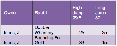
The world of rabbit steeple chasing is highly competitive. It turns out that one of the club members has been involved in a bunny doping scandal! You are to amend the results for J Jones’s rabbits. A 50cm penalty is to be put against both his rabbits.
The new results are:

Activity
- In the spreadsheet Steeplechase_results.xlsx change J Jones’s results to what is given above. Right away you should see the chart in the sheet change. Save your chart.
- Go back to your document rabbit_3.docx. The chart in the sheet should have also changed:

- Print the Document. Save your document and close word.
|
Formatting a linked chart in Word
Open the document you created in the previous activity with the linked chart in it.
We are going to make some changes to the chart:
- We’re going to change the colour scheme, as currently when printed in black and white we can’t distinguish between the grays
- We are going to change the text size of the rabbit names
Activity
- Click on the linked chart in your document – you should see a new tab called Chart Tools appear. This is exactly like the chart tools tab in Excel.

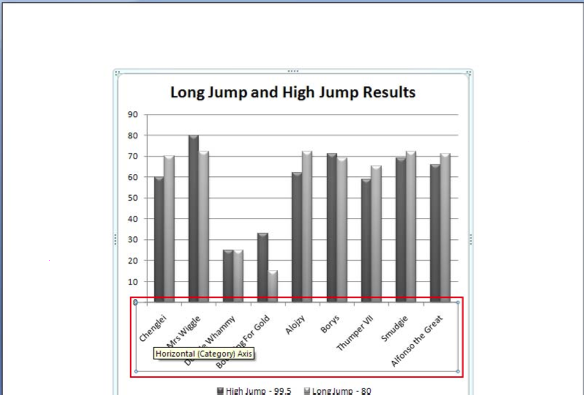
- Choose a grey scale colour scheme from the chart styles. There should be an obvious difference between the two columns as in the picture above.
- Click in the axis with the rabbit names. A box with selection handles will appear. Go to Home ⇒ Font group and change the font size to 12 points. Print your document. Save and close word.
|
Manually updating linked objects
Remember that you might have to “refresh” your word document in order to update changes that you have made:
- Right click on the object in Word - usually this would be a table. A context-sensitive menu will appear.
- Click on Update Link. This will force Word to manually update the table.

|


