Desktop publishing/Project 3/Plan
| Desktop publishing | |
|---|---|
| Project 3 | Introduction | Plan | Create | Evaluate | Key points | Assessment |
In this unit we will look at how to put together a two-fold brochure: a publication based on a single landscape A4 sheet with two vertical folds which divide the page into three panels.
Note: confusingly, this format is sometimes called a three-fold format because of the three panels!
You are probably already familiar with this format as it is widely used for advertising and communicating information. Let's look at an example.
Sample two-fold brochure
The folded brochure showing the front cover:
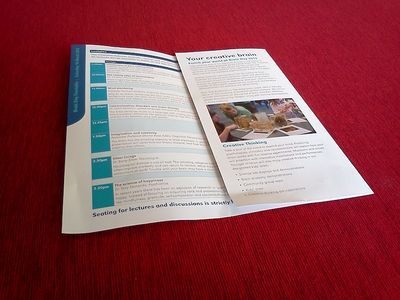
With the front cover open but the inner flap still closed:
Note that the inner flap needs to be slightly narrower than the other two panels, as it is folded inside.
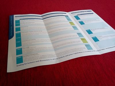
With the brochure fully open - note the way elements are arranged within the three panels:
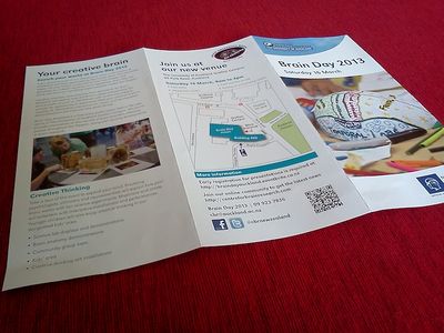
The other side of the brochure, showing the front cover on the right and the back cover in the middle panel:
Again, note the way the elements are arranged within the three panels.
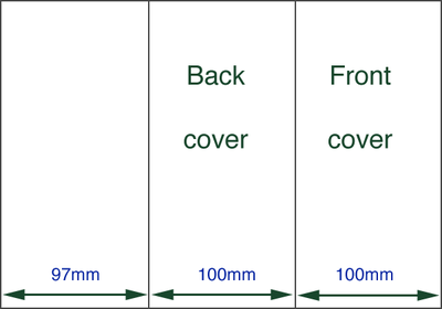
Two-fold brochure layout
Since the inside panel is folded inside, it needs to be slightly narrower than the other two panels. This seems complicated, but given the dimensions of a standard A4 sheet (210 X 297 mm) the calculation is really quite straightforward:
97 + 100 + 100 = 297
Looking at the outside of the brochure (ie the "back") the dimensions of the three panels are:
The 3mm difference of the inner panel is enough to allow it to fold inside the other two panels.
Luckily, a DTP application such as MS Publisher provides templates which make producing a two-fold brochure easy - the width of each panel is set for you. But obviously the placement of the elements within the correct panels is crucial, so you do to plan that carefully.


