Use the following quiz questions to check your understanding of density curves and normal distributions. Note that as soon as you have indicated your response, the question is scored and feedback is provided. As feedback is provided for each option, you may find it useful to try all of the responses (both correct and incorrect) to read the feedback, as a way to better understand the concept.
Scatterplot
Scatterplot
For which two variable combinations is a scatterplot the appropriate graphical display?
- Quantitative explanatory variable and quantitative response variable
- That's correct. When both variables are quantitative, a scatterplot is a useful graphical display.
- Categorical explanatory variable and categorical response variable
- That's not quite right. When both variables are categorical, the data would be displayed using a two-way table of counts and percents. Try again.
- Categorical explanatory variable and quantitative response variable
- That's not quite right. When the explanatory variable is categorical and the response variable is quantitative, boxplots would be an appropriate graphical display. Try again.
Scatterplot
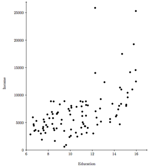
In a 1971 study of 102 Canadian occupations, researchers determined the average income (in dollars) and average education (in years) for incumbent candidates. The scatterplot at right shows the relationship of these two quantitative variables. Use the scatterplot to answer the questions.
- The direction of the relationship shown in the graph is positive (positive/negative/neither positive nor negative), which means that as the number of years of education increased, the amount of income increased (increased/remained the same/decreased).
- That's correct. The direction is positive; as the number of years of education increase, the amount of income also increases.
- That's not quite right. In a positive relationship, as the values of one variable increase, so do the values of the other variable. Try again.
- The form of the relationship is curvilinear (linear/curvilinear/neither linear nor curvilinear).
- That's correct. In considering the line which would best fit the points, it forms an upward curve as the number of years of education increases.
- That's not quite right. Consider the line which would best fit the points. If it's straight, the relationship is linear, if it's curved, the relationship is curvilinear, and if no one line seems to fit the data, the relationship is neither linear nor curvilinear. Try again.
- The strength of the relationship is moderate (strong/moderate/weak).
- That's correct. As the points cluster loosely around a best fit curve, the relationship would be considered moderate, although it can be problematic to assess the strength of a relationship without a numerical measure.
- That's not quite right. Although it can be problematic to assess the strength of a relationship without a numerical measure, the points do cluster loosely around a best fit curve. Try again.
- When should you consider labeling the points in a scatterplot? When
- A scatterplot looks at the relationship between two quantitative variables. Labeling the points as to the categories of a third, categorical, variable may provide further insight into the relationship being explored.