Sample math lesson
Contents
Reading Graphs
In all of the percent problems that we have worked with so far, we have been given the numbers that we need to calculate the answer. In general, we are given any two of:
- the whole
- the part
- the percent
... and we are asked to find the "missing" value.
But we can also be given the information in a different way -- in a graph. A graph is a sort of a picture of how the numbers in a problem relate to one another.
Circle Graphs
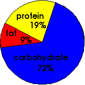
One of the simplest graphs of all is the circle graph also known as a pie chart. A circle graph is used to show how parts of a whole are related. It is divided into "slices" that usually represent percents, or sometimes parts of a dollar. The whole circle represents 100%, so all of the slices will add up to 100. Here is an example of a circle graph:
Nutritional composition of a "pork and beans" meal:
The first thing to notice when you look at a graph is the title. Reading the title carefully can save you a lot of confusion later on! This graph is showing the nutritional composition of pork and beans. The next thing to look at is the type of units. This graph is comparing percentages. And, as you can see, all of the percents add up to 100%.
- protein
- carbohydrate
- fat
- not enough information is given}}
- Answers
- Of course, you can see from the graph that carbohydrate is the largest component in the graph. So the correct choice is (2).
- 10% more protein than fat
- 10% more fat than protein
- 10 times more protein than fat
- 10 times more fat than protein}}
- Answer
- As you can see in the graph, there is 19% protein and 9% fat in this meal. To find the answer, you simply subtract: 19 - 9 = 10. So the correct answer to the question above is (1).
- Which component of this graph represents about 1/5 (one-fifth)?
- What is the ratio of carbohydrate to fat in a meal of pork and beans?}}
- Answers
- Protein represents 19% of the nutritional composition of pork and beans. Since 19% is almost 20%, and we know that 20% = 1/5, protein is the correct answer to this question.
- The ratio of carbohydrate to fat is 72 : 9. This reduces to 8 : 1 (eight to one).
Bar Graphs
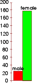
Another very common type of graph is the bar graph. A bar graph is used to show how two or more different amounts are related. Here is an example of a simple bar graph:
Number of employees at Fairview Extended Care Facility
As you can see, this bar graph is showing the relative numbers of male and female employees at the Fairview Extended Care Facility (nursing home). You can see that the bar which represents the female employees is much taller than the bar which represents male employees. Obviously, there are more women than men employed at this facility.
How many women work at this facility? To figure this out, look at the top of the bar for women. Now look at the numbers on the left side of the graph. These numbers make up the scale of the graph. Which number is closest to the top of the bar representing women? The number 180 is close to the top of the bar for females. In fact, if you look carefully, you can see that the top of the bar comes to a point just under the mark for 180. So you can guess that there are somewhat less than 180 female employees at this facility.
(a) About how many men work at this facility?
- between 15 and 20
- between 20 and 25
- between 25 and 30
- more than 150
(b) About what percent of the employees at this facility are males?
- 2 %
- 5 %
- 10 %
- 20 %
- 50 %
Answers
(a) If you look at the scale beside the top of the bar representing men, you can see that the top of the bar is just above the number for 20. So there must be a little more than 20 male employees here. The correct choice is (2).
(b) This question is a little tougher! We know that there are about 20 male employees and about 180 female employees. So there are about 200 employees in all (this amount represents the whole). Our question could now be re-written: what percent is 20 out of 200? We can set up a percent proportion:
| part | ? | 20 |
| whole | 100 | 200 |
Now we can cross-multiply in the usual way: (20 x 100) ÷ 200 = 10 % About 10 % of the employees are males (choice 3).
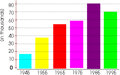
Bar graphs are often used to compare totals from different years (or months):
Population of the City of Fairview
You can see that there are two scales on this graph. The scale along the bottom shows the year. The scale along the left side shows the population of Fairview -- but can you see that the values shown are in thousands?
For example, you can see that the top of the bar for the year 1945 is between 10 and 20 -- in fact, it looks like it would come to about 17. But does this mean that there were only 17 people in Fairview in 1945? No! The values shown are in thousands (as you can see from the print that is written sideways along the left side of the numbers). So the population in 1945 was actually around 17,000. Here are some more questions based on this graph:
- In which year was the population highest?
- Which year showed a decrease in population?
- By how much did the population increase between 1945 and 1975?
- What was the percent decrease in the population between 1985 and 1995?
Answers
- The population was approximately 54,000 or 55,000.
- The population was highest in 1985.
- The population showed a decrease in 1995.
- To calculate this, we must first figure out what the population was in 1945 and 1975. If you look carefully at the graph, you can see that the population in 1945 was about 17,000. The population in 1975 was about 59,000. So the population increased over these years by:
- 59,000 - 17,000 = 42,000
- 5. To calculate the percent decrease, we must first calculate what the population was in 1985 and 1995. In 1985, the population was about 80,000. In 1995, the population was about 70,000. So the population decreased by:
- 80,000 - 70,000 = 10,000
- Now, we must calculate the percent decrease:
| part | ? | 10,000 |
| whole | 100 | 80,000 |
- Cross-multiply in the usual way:
- (10000 x 100) ÷ 80000 = 12.5 %
- The population has decreased by about 12.5 %.
Line Graphs
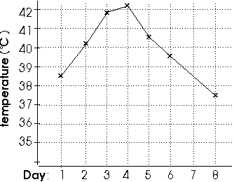
The last kind of graph that we will look at is the line graph. Line graphs are used to show values that change continously over time. On a line graph, we "connect the dots" for the values that we know. We can then make a good guess at what the values were for the years (or months) in between the values that we know for sure. Here is an example of a line graph:
Body temperature during Pneumonia-induced fever
Have a careful look at the two scales on this graph. The scale along the left side shows the body temperature in degrees C (normal body temperature is about 37.5°). The scale along the bottom shows the days since the pneumonia began. Can you find the temperature on Day 1?
Look along the bottom scale until you find the number "1". There is a vertical line going up from this "1". Look up this line until you can see a little "x". Now look over on the left-side scale. What number is close to where this "x" is? Can you see that the temperature on Day 1 was between 38° and 39°? In fact, it looks like the temperature was about halfway between these two values. We can estimate that the temperature on Day 1 was about 38.5°.
(a) What was the temperature on Day 3?
- about 40.2°
- about 41°
- about 41.8°
- about 42.3°
(b) On what day was the temperature the highest?
- day 3
- day 4
- day 5
- day 8
(c) By how much did the temperature decrease between day 5 and day 6?
- about 1 degree
- about 2 degrees
- about 10 degrees
- less than half of a degree
(d) There is no little "x" on Day 7. This means that the temperature was not taken at all on this day. However, we can look at the graph and guess what the temperature was on that day. What do you think that the temperature was on Day 7?
- about 39.5°
- about 39°
- about 38.5°
- about 37.5°
Answers
(a) The correct choice is (3): about 41.8°. You can see that the temperature on this day was between 41° and 42°, and you can see that it was actually much closer to 41°. About 41.8° looks like the closest guess.
(b) The correct choice is (2): the temperature was highest on Day 4. This is the day where the line graph was at the highest value (over 42°)
(c) The correct choice is (1): the temperature decreased by about 1 degree. If you look carefully, you can see that the temperature was about 40.5° and on Day 6 it was about 39.5°. If you subtract these two values, you will see a decrease of about 1.0 degree.
(d) The correct choice is (3): the temperature was about 38.5°. If you look up the line for Day 7, you can see the place where the vertical line is crossed by the line of the temperature graph. The lines intersect (meet) at around 38.5°.
| Ready for Reading Graphs: HOMEWORK?
|


