ResearchMethods/QuantMix/CategData
Contents
Introduction
You know how a picture can be worth a thousand words? Same goes for research results. Tables and graphs, when properly designed, can provide clear pictures of patterns contained in many thousands of pieces of information. In this pathway, we will describe several ways of displaying information about categorical variables in tabular and graphic form.
Frequency Tables
A frequency table (or frequency distribution) displays numbers and percentages for each value of a variable. It is useful for categorical variables (that is, those with values falling into a relatively small number of discrete categories, such as party identification, religious affiliation, or region of a country) rather than for continuous variables (such as age in years or gross domestic product in dollars).
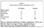
The following frequency distribution shows, by region of the country, how many state legislatures are controlled by each major party. (In four states, each party controls one of the state's two houses, while in one state, Nebraska, the legislature is officially non-partisan.

The first column in the table provides a label for each category of the variable. The second and third columns show, respectively, the number and percent of cases in each category for all cases. The fourth column shows the percent in each category after eliminating cases for which we do not have information (missing data). Since we know the party composition of every state legislature, the fourth column is identical to the third in this case. The last column shows the cumulative percentages as one goes from the first to the last category. Note that this last column makes sense only if the values of the variable can be meaningfully ranked. In other words, cumulative frequencies assume at least ordinal level measurement. The numbers in this column make no sense in this example, since it wouldn't be meaningful to say that "98 percent of state legislatures have split majorities or less."
Contingency Tables
A contingency table (also called a crosstabulation, or crosstab for short) displays the relationship between one categorical variable and another. It is called a “contingency table” because it allows us to examine a hypothesis that the values of one variable are contingent (dependent) upon those of another.
The following crosstabulation shows the relationship between control of state legislatures and region of the country at the start of the 113th Congress (2013-2014):

There are several important things to notice about the way in which the table has been set up:
- The table consists of a matrix of rows and columns. Since there are four rows and four columns, it would be referred to as a “four by four” table. A table with four rows and three columns would be referred to as a “four by three” table. (Note that the number of rows is always given first.) The values of one of the variables are placed in the rows and those of the other in the columns. Usually, as in this example, the dependent variable is the row variable and the independent variable is the column variable. There is, however, no requirement that this be the case. If it fits the available space better to put the dependent variable in the columns, go ahead and do so.
- The number of cases in each cell of the table has been converted to a percent. In this example Democrats held majorities most state legislatures in the Northeast and West, while Republicans controlled most state legislatures in the South and Midwest. By converting numbers of cases to percents, we facilitate making comparisons among regions, despite differences in the number of states in each region, since each region totals to the same 100%.
- In this instance, we have percentaged down the columns rather than across the rows. When using contingency tables to test hypotheses, always percentage in the direction of the independent variable. This is necessary because we are testing the idea that different categories of the independent variable will tend to have different values for the dependent variable.
- The table includes information on the number of cases (N) on which the percentages are based. When there are a large number of cases in each category, we can be more confident that the patterns we observe aren't merely coincidental. There are more systematic ways to assess the reliability of percentages in a crosstab, but we will not discuss them here.
When you interpret a crosstab, be careful the details do not distract you from the overall picture. In this case, the table shows that there are substantial regional differences in party strength.
Making Tables Presentable
The frequency distributions and crosstabs are presented above just as they were generated by SPSS. For use in a proposal, report, or academic publication, however, the tables need to be more aesthetic. The following tables are a little more presentable, and also contain a bit more information, including 1) a title that briefly describes what the table is about, and 2) the source of the data used to generate the table. At the same time, a lot of extraneous information has been left out. Tables usually present information only for valid cases. Cumulative percentages are omitted from Table 1, because region is only a nominal variable. Individual cell counts and row totals are omitted from Table 2, because this information can be reconstructed if needed from the information that is provided. Learning to shape the tables you present in your work is an important part of learning statistical analysis. It will probably take a few attempts before you get the best result.

Pie Charts
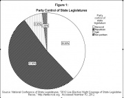
A pie chart is a simple way to show the distribution of a variable that has a relatively small number of values, or categories. Figure 1 provides in graphic form information similar to what table 1 (above) presents in tabular form:
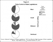
Similarly figure 2 is analogous to table 2, and breaks the results down by region:
Bar charts
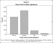
Another way to portray the information contained in table 1 and figure 1 is with a bar chart, as shown in figure 3:
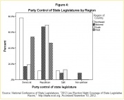
Finally, figure 4 shows a "clustered" bar chart, with results displayed for each region. It is similar to table 2 and figure 2.
Credits
John L. Korey 2013, POLITICAL SCIENCE AS A SOCIAL SCIENCE, Introduction to Research Methods in Political Science: The POWERMUTT* Project, [1]