OERu/Planning/Technology working group/2014-10-03
From WikiEducator
< OERu | Planning | Technology working group
Agenda
- Review progress of course site theming project
- Headings and subheadings (previously each sub-section was a separate tile).
- Example iDevice
- Learning console page with collapsible panel
- Example of 3rd level navigation options (Breadcrumb or modal side-of-page icon)
- Support tutorial links
Notes
- en.WikiEducator now supports SSL, simplifying including IFramed content in an institutional LMS
- Group prefers the implementation of headings and subheadings without separate tiles for each subheading.
- Group are happy with the look and feel of the iDevice elements
- Discussed the advantages and disadvantages of the prototype breadcrumb versus floating icon element for 3rd level navigation.
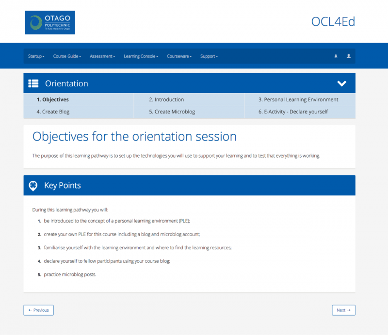
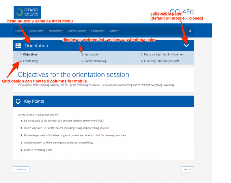
- Group prefers a breadcrumb-like solution but recommend that 3rd level navigation should become a page element rather than being incorporated into the main site navigation. Tim Klapdoor has prepared a mock-up illustrating this implementation. (see images below.)
- Discussed the header logo area and felt that this implementation was consuming considerable real-estate, particularly for mobile devices. Possible solutions to suggest to NewSpash:
- Move institutional logo to the footer area
- Keep institutional logo on the landing page but don't display on other pages. For mobile devices / responsive design, implement a solution where the logo is moved to the footer area, see for example CSU's mobile hub page.
- Tim USQ shared the idea for posting micro-tasks with nominal bounties as mechanism to engage students in coding small projects for OERu.
Tim Klapdoor prepared a mock-up to illustrate a recommended solution for 3rd level navigation where:
- Navigation becomes a page element.
- Nested inside a collapsible panel
- Show as ordered list instead of breadcrumbs
- Use 3 & 3 column grids for desktop and mobile

