Displaying distributions with graphs/Self-check assessment
From WikiEducator
Jump to: navigation, search
Use the following quiz questions to check your understanding of how to examine statistical data with graphs. Note that as soon as you have indicated your response, the question is scored and feedback is provided. As feedback is provided for each option, you may find it useful to try all of the responses (both correct and incorrect) to read the feedback, as a way to better understand the concept.
Contents
Graphs for categorical variables
Bar graphs
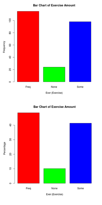
The graphs at right display the responses of 237 students at the University of Adelaide, Australia, as to the amount of exercise they engage in.
- What is the difference between the two bar graphs? y-axis.
- The bars in the upper graph display the frequency of each value (or category), while the bars in the lower graph show the percent of the total for each value (or category).
- The results suggest that the students are not (are/are not) equally divided among the different levels of exercise. Most of the students (48.5%) indicated that they exercise frequently (frequently/some/not at all). Slightly fewer students (41.4%) indicated that they exercise some (frequently/some/not at all). Very few students, about 10%, indicated that they did not exercise at all.
- It would be equally (more/less/equally) useful to display the data on frequency of exercise in a pie chart.
Frequency distributions
Frequency tables
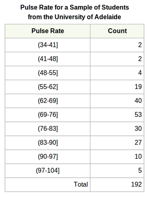
The table at right displays the pulse rates of 192 students at the University of Adelaide, Australia.
- The percentage of students with a pulse rate above 90 is 7.8%. (The square bracket in the interval label indicates to include the value, the single parenthesis indicates to exclude the value.)
Stemplots
Understanding types of graphs
- Given the following stem and leaf plot (also called a stemplot), the highest value in the dataset is 132.
| Enter Feedback here |
Understanding types of graphs
- Stem and leaf plots (also called stemplots) are useful for comparing three groups.
- True
- That's not quite right. Back-to-back stem and leaf displays are good for comparing two groups, but stem and leaf plots are not a useful format for comparing the distributions of three or more groups.
- False
- That's correct. Stem and leaf plots are not well-suited for comparing the distributions of three or more groups.
- True
Histograms
Histograms
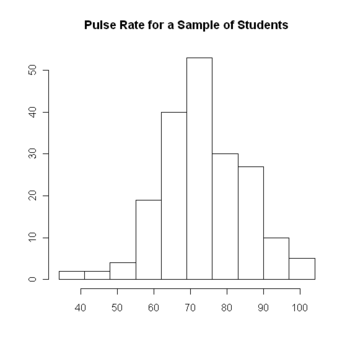
The histogram at right displays the pulse rates of 192 students at the University of Adelaide, Australia. The axis labels have been omitted. Refer to the graph to answer questions 1-3.
- What do the numbers on the horizontal axis represent?
- The values of the students' pulse rates.
- That's correct. The values of the quantitative variable are displayed on the horizontal axis.
- The count (or frequency) of the students' pulse rates which fall in each of the intervals.
- That's not right. The values of the quantitative variable are displayed on the horizontal axis.
- The values of the students' pulse rates.
- What do the numbers on the vertical axis represent?
- The values of the students' pulse rates.
- That's not right. In a histogram, the vertical axis displays the count (or frequency) of the values in each interval.
- The count (or frequency) of the students' pulse rates which fall in each of the intervals.
- That's correct. In a histogram, the vertical axis displays the count (or frequency) of the values in each interval.
- The values of the students' pulse rates.
- What is the largest pulse rate in the dataset?
- 100
- That's not right. Although the scale of the horizontal axis ends at 100, it does not mean that this is the largest value.
- 104
- That's not right. Although the uppermost interval in the graph includes the value 104, there may or may not be a value of 104 in the dataset.
- Not available from the graph.
- That's correct. When data are displayed in a histogram, the particular values of the variable are no longer evident.
- 100
- What does the "class (or bin) width" of a histogram refer to?
- The range of scores after allowing for some "padding."
- That's not quite right. In a histogram, the data is divided up into equal intervals called classes. Try again.
- The average relative frequency of each class.
- That's not quite right. The relative frequency would be the number of individuals in a class divided by the total number in the sample. The width of the classes is related to the interval size of the classes. Try again.
- The degree to which the distribution shown by the histogram is skewed.
- That's not quite right. Skewness is a property of the specific data being displayed. The width of the classes in the histogram relates to the interval size of the classes. Try again.
- The result of dividing the range of scores by the number of classes.
- Correct. The class width specifies the interval size for the classes.
- The range of scores after allowing for some "padding."
- What do you think the shape of the distribution of job tenure (number of years of consecutive work) for college professors would be if graphed in a histogram?
- Symmetric, unimodal
- That's not quite right. If the distribution is symmetric, unimodal, then most of the observations will be in the middle, and there will be matching tails on both sides. Many professors work for only a few years at any one college, while fewer professors work for many years at one college. Try again.
- Symmetric, bimodal
- That's not quite right. If the distribution is symmetric, bimodal, then the majority of observations occur at two different points along the scale of number of years. Many professors work for only a few years at any one college, while fewer professors work for many years at one college. Try again.
- Symmetric, uniform
- That's not quite right. If the distribution is symmetric, unimodal, then the observations are evenly spread all along the scale of number of years. Many professors work for only a few years at any one college, while fewer professors work for many years at one college. Try again.
- Skewed right
- That's correct. The majority of professors work for only a few years at any one college, while fewer professors work for many years at one college. Therefore, we expect the distribution of job tenure to be skewed right, to have the bulk of the observations on the left with small numbers of observations extending into the right tail.
- Skewed left
- That's not quite right. If the distribution is skewed left, then the majority of observations occur on the right and there is a long tail of observations out to the left. Many professors work for only a few years at any one college, while fewer professors work for many years at one college. Try again.
- Symmetric, unimodal
Line graph
Line graphs
http://onlinestatbook.com/2/graphing_distributions/line_graphs_files/image004.jpg
The image above displays a line graph depicting the number of people playing different online card games on Sunday and Wednesday.
- Why is this an inappropriate use of a line graph? because...
- It is misleading to use a line graph when the x-axis contains the values of a categorical variable. The graph gives the false impression that the games are naturally ordered in a numerical way.[1]
Notes
- ↑ Adapted from Line Graphs at Online Statistics Education: An Interactive Multimedia Course of Study. Project Leader: David M. Lane, Rice University. Retrieved 24 August 2012.


