Comparing multimedia
Contents
Evaluation Criteria for a learning Resource
| Multimedia learning resource chosen: | Demo 1 Introduction to Word Processing |
Demo 2 Cardio Pulmonary Resuscitation (CPR)
|
| Author of the resource: |
Onlineformapro S.A |
e-MERSION Creative Solutions
|
| Home Page |
| |
| Web address of the resource: |
http://www.articulate.com/community/guru/2009/CPR/index.html | |
|
The audience: |
Anybody who wants to learn how to use Word 2000 The course is a beginners course for those who want to learn how to use Word 2000, in particular, how to add Borders and Shading, Bullets and Numbering and how to insert symbols. There is no mention about prerequisite skills; however a user must know how to highlight text. |
Anybody interested in life saving good practice The level of competency and prior-knowledge required is negligible. The orientation targets ordinary people, with almost no prior knowledge, to make them possible life savers. |
| Brief description of the resource: |
It is an online introductory course on Word Processing. It allows a user to practice formatting, specifically, how to apply Borders and Shading, Bullets and Numbering and how to insert symbols. In addition to the course, it provides learning resources, interactive exercises and multiple choice questions. |
It is an orientation teaching people the steps to perform Cardio-Pulmonary Resuscitation (CPR). What to do if someone find a person unconscious after an accident? The simple demo allows a person to learn the best practices in such situation while waiting for help to arrive. |
Similarities and Differences :
Demo 1 is an e-learning course on word processing developed by Onlineproforma S.A. This course is an introductory course meant for people wanting to learn word processing. In this particular Demo learners will be able to practice formatting skills such as adding borders and shading, bullets and numbering etc. However the learner must know how to handle the mouse and keyboard and should be familiar with the WORD environment.
Demo 2 is an orientation on Cardio Pulmonary Resuscitation and is developed by e-Mersion Creative Solutions. It targets the general public that is anyone who wants to learn how to practice CPR. No prior knowledge is required for this orientation.
The Content:
| 1. Appropriateness of level |
The resources can be used by beginners in Word Processing. The language level used is simple; the instructions are short and clear, therefore understood by anyone who can read French. |
The resource can be used for ordinary street people, the animations and language level are within the reach of anybody.
|
| 2. Organization of information |
The information is organized in four parts:
|
The information is organized in three parts:
The orientation is organized in slides created by Articulate. |
| 3. Clarity of information |
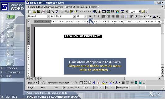
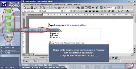
Each lesson is presented as a series of instructions that user has to follow consecutively. The instructions are short and clearly indicated in a text box in yellow font. Additional information or explanation is given in the same text box but in white font. An animated arrow is available to indicate the user where to click precisely. |
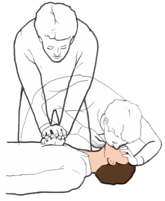
The information is presented in a logical, one by one, animation; the graphics are simple 2-D black on white drawings with no cluttering of information. |
| 4. Depth of information |
The course is more oriented towards practical rather than theory; therefore the lessons contain little text but more graphics and animations. The user learns just by following the simple instructions and completing the practical lessons. More in depth readings can be found in the Resources section. |
The presentation is practical and direct to the point. No technical aspect of the subject is treated. No higher order skills are explained and required.
The aim being to create the required reflex in such drastic circumtances. |
| 5. Easy to understand |
The course is easy to follow. Though in French, the instructions are understood without difficulty. Moreover the animated arrow indicating where to click is really helpful. The results are clearly visible and understandable. The images are exactly the same as a Word window, thus a user can retry these same exercises without any problem in Ms Word program. |
The images are clear and of good quality, the language used is simple English with no technical jargon. The orientation is simple to understand |
Similarities and Differences
1. Appropriateness of level
Both multimedia are meant for people without demanding prior knowledge and is supposed to be within the means of everyone wanting to learn, however for DEMO 1 the user must have at least a basic level of graphical user interfaces and be acquainted with Microsoft Word icons. Furthermore the user must be able to use the mouse easily, to proceed through the demo the user will have to follow all instructions provided and click exactly on the asked items the given drop down menu.
The DEMO will not be appropriate for first time WORD users.
On the other hand DEMO 2 is more accesible to a larger public and the level is more appropriate for the target audience.
2. Organization of information
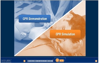
DEMO 1 and DEMO 2 are both broken in different parts. The information are segmented and presented portionwise. However in DEMO 1 the information is divided according to tasks. Each part deals with the steps required to perform a given task. While in DEMO 2 the information is divided according to the information type, that is , Demonstration or Simulation type. The user can choose between the type of activity s/he wants.
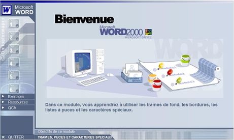
The content of the DEMO in DEMO 1 is accessed via the sequencial classification on the left hand side in the task bar, thus a user can choose to view activity 4 before activity 3 or vice versa. The is no predetermine order for information viewing even though the activities are enumarated from 1 to 6.
For DEMO 2 the content is shown side by side separated by a diagonal line. The User will have to view the Demonstartion first then only the person will be able to perform tha activities in the simlation.
3. Clarity of information
In DEMO 1 the instruction are written and animations, especially the arrows clearly indicate what should be done, things to be perform by the user is shown in yellow. So it is quite clear what is being shown. The main drawback being that as the user clicks the written instructions dissapear so that the user will have to memorize what s/he has just read.
In DEMO 2 the animations are supported by narration and it is even clearer to understand the movemenst and information. The user can choose to have the written information as well, this is provided as an option. the written instructions will remain as long as the demo is on.
The Images in DEMO 2 is plain black on white graphics. It delivers the essentials and is very simple so that there cannot be any misconceptions.
4. Depth of information
Both DEMOs target the large public, but DEMO 1 deals with a more technical subject while DEMO 2 is more practical and applies to real life situation. Learning WORD processiing being more technical and requiring explicit as well as tacit knowledge the DEMO contains more in depth knowledge. The user is provided with further resources for more in depth information.
Practicing CPR is purely practical, the multimedia is more a training session teaching the right behavior and attitude to have in those situations. The user will have to develop the psycho-motor skills, the way the hands must be placed, the position on the body to press, the right frequency and so on...
5. Easy to understand
It is true that the subject addressed in DEMO 1 is more difficult to understand than that treated in DEMO 2. One is technical while the other is practical related to real life. However the way the information is presented is easy to understand in both DEMOs. In DEMO 1 the arrows are of great help in helping the user to understand what must be done. In DEMO 2 the narrative part effectively support the animations and the user can easily understand what steps to be undertaken.
Pedagogical content:
|
1. Clarity of objective |
The objective of the demonstration is clearly stated on the homepage. The objective of each lesson is also stated at the start. Therefore the user knows exactly what he will be learning. |
The sole objective of the demonstration is clearly stated at the start. The person knows exactly what will be taught and what is expected from him. |
| 2. Pedagogical function of the orientation |
The demo is appropriate for users who want to practice with formatting. The lessons and resources will enable a person to learn how to add borders and shading, how to create bulleted or numbered list and how to add special characters. The user can practice using this demo and execute the same steps in Word program.
|
The function of the orientation is to train people so that he/she knows exactly what to do in case of accident. This exercise can empower people to save the life of other people. |
| 3. Content description |
The demo has four sections. The main highlight is the first section which contains six lessons on formatting. The lessons contain the following:
In each lesson the objective is stated at the beginning. Instructions are clearly given on how to proceed with the exercise with the help of an animated arrow. Navigation buttons are present to allow the user to move forward or backward. The second section is in two parts. The first part provides links to interactive exercises which are the same as in section 1 but without the arrow indicating where to click. This is mainly to practice the exercises on your own without help. The second part is a list of printable exercises that the user can practice in Ms Word program. The third section contains resources explaining the various types of formatting and the steps on how to do them. In addition it has information on page setup, a list of shortcut keys and a glossary of terms which can be helpful to the user. These resources are also in printable format. The fourth section contains multiple choice questions to test the knowledge of the user. The correct answer is given after attempting each question and feedback is provided at the end. |
The orientation is divided in to three parts:
|
| 4. Logical organization of content |
The content is organized in such a way that the user first practices the formatting exercises. Then if the user chooses he can practice them again but more autonomously. Else the can chose to go through the resources provided. |
The content is organized in the following way: Intro Cognitively Active Learner Practicing learner Rewards/ reinforcement with feedback. |
| 5. Feedback |
Feedback is provided for multiple choice questions after attempting each question. |
The learner is provided with immediate and appropriate feedbacks after completion of each part of the activity in CPR simulation.
|
Similarities and Differences
1. Clarity of objective
The objectives of the lessons are clearly stated in both DEMOs. DEMO 1 includes clear objectives at the start of each part so that the learners know exactly what is expected from them.
2. Pedagogical function of the orientation
DEMO 1 can be used for the formation WORD processing operators as well as for the devolopment of text treatment skills. DEMO 2 main purpose is to train non professionals in the field of medecin to empower them to practice CPR.
The pedagogical functions of the 2 DEMOs are very different and thats why they must adopt different approaches.
3. Content description
The content of DEMO 1 is very focused, dealing with specific aspects of word processing such as adding borders, frames.... while the content of DEMO 2 is more general treating only with the simple steps to practice CPR. These steps can be applied to all individuals and to any circumtances.
4. Logical organization of content
DEMO 2 is organised in a more logical way than DEMO 1. In DEMO 2 the user just view and listen to the demonstration, the multimedia provide a structure to help the learner to build his own mental model and internalise the steps to go through before performing a CPR on an unconscious person.
DEMO 1 seems to be just a bunch of activities to be learnt to be able to use microsoft word. The learner can just move from one activity to another in any random order. Why is creating of bulleted text placed after adding borders and shadings?
5. Feedback
Both DEMOs provide appropriate feedbacks after completion of an activity. The feedbacks help the learner to bring corrective measures to any mistakes and provide encouragement (rewards) for good answers.
|
Navigation Bar
|
The demo has a vertical navigation bar that contains button links to the lessons and text links to the other resources. The vertical navigation bar allows the user to navigate through the demo. When the cursor is pointed on a button link, an animated text box appears that shows the title of the lesson. When the link is clicked the button turns green but only partialy. Upon completion of the lesson the buttons link turns completely green At the bottom right corner of the screen, there are the Next and the Previous button that allow the user to navigate back and forth. However there no progress bar or any other indication as to where the user has reached in the lesson.
|
The learner can learn how to navigate the resource by clicking on the link above the information panel.
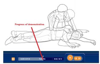
There is a simple animation showing the navigation cues on the screen. The time left for each slide is shown at the top of the information panel. The slide being viewed is indicated at the bottom with an indication of the viewed portion. The learner can easily locate where he/she is in the demonstration at each moment .
|
Similarities and Differences
Demo 1 has a single navigation bar on the left hand side that has links to the lessons and resources. A learner can select any lesson at random by clicking on any button link.
Demo 2 has a completely different navigation system. At the bottom there is a progress bar to indicate to the user his/her progress and the time left for each slide. On the top left corner of the screen a there is a link available to explain to the user how to navigate.
In Demo 1 the user can know which lesson he is attempting but not exactly his progress through the lesson.
Technical aspects:
| Links and loading speed |
All links in the demo work properly. The lessons and resources do no take too much time to load. The transition from one screen to another also is quite quick. Clear directions are provided and the arrow in the lessons indicate the correct part of the window that the user has to click
|
All the links in the presentation work properly. The animations load quite rapidly and the progress is indicated. The audio complement the visual explanation correctly.
|
Principles:
|
1. Multimedia Principle
|
The content is presented using the visual channel only. The user is expected to read the instructions and resources. The animation enhances the visual display and allows better understanding.
|
The explanations are delivered through both visual and audio channel. The sounds and visuals are simultaneously present and complement each other. Students are exposed to more information and at the same time deep learning can occur.
|
| 2. Split-attention principle |
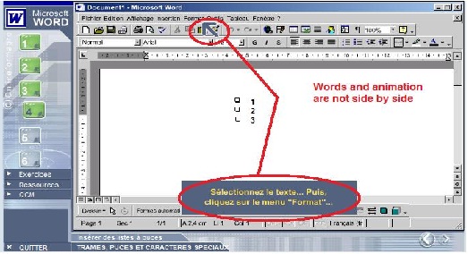
A few times, the animated arrow distracts the attention of the user from the instruction provided. The user tends to click at the position indicated by the arrow while the instruction may indicate to click the next button. In some screens the instructions for a given task is far from the position indicated to click causing the learner’s attention to split. |
The audio explanation accompanies the visual display; they are temporally close to each other in the demonstration.
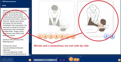
However the written words are quite far from the display area. |
| 3. Redundancy principle |
The content is relevant and aligned with the instructional objective. Redundant information is excluded. However, narration together with animation could have made learning better
|
Only useful information are shown on the screen, all redundant information are immediately removed when not required. The screen thus always contains only one diagram at a time. The animations and graphics are narrated and the written explanation is available on demand by clicking on the bottom right button. This is useful is the demonstration is to be used by deaf people.
|
| 4. Segmenting principle |
The screens for each lesson are presented in a linear fashion and are not segmented. The user has to start from the first screen and move towards the end by clicking on consecutive screens. The user is not allowed to jump to a random screen in the same lesson. However navigation buttons on the bottom right corner allow the user to move to the previous or next screen. The user can also jump from one lesson to another anytime. |
The CPR Demonstration is linear and not segmented; the slides are in a continuous unit until the end is reached. The Demonstration could have been presented in several segments this would have increased the learner control. The learner could then choose the pace at which he/she wants to proceed. However at the bottom, the learner can stop the show, rewind and even forward it but this could have been included in the design itself. |
| 5. Modality principle |
The content and navigation are presented in a consistent way throughout the demo. The text and animations are similar in all lessons. |
Throughout the demonstration there is consistency and the same mode of communication is used, the animations accompanied by narrative explanation.
|
Similarities and Differences
1. Multimedia Principle
Both DEMOs apply the multimedia principle, that is the use of dual channel to transmit information enables better understanding as well as processsing of larger amount of information per unit time. DEMO 1 uses visual display and text while DEMO 2 uses visual and narrative.
2. Split-attention principle
DEMO 1 does not always follow this principle, sometimes the text containing the instruction to be perform is not placed near the animated arrow and this can mislead the user. However most of the time the arrows and the text instructions are in parallel and are of great help to the users.
DEMO 2 on the other hand is better concerning the split attention principle as long as the narrative is concern, but when the caption containin the text information is used the text is on the complete left of the screen while the animation may be on the right, so if a learner is to read the message he will definitely miss the animation and the visual support. It is not very effective and quite tiring since the text is placed quite far from the animation.
3. Redundancy principle
The screen in DEMO 1 is quite cluttered, there are hundreds of other icons while the user is required to use only one of them. Perhaps while using a pull down menu the other icons could have been temporarily removed to enable the learner to concentrate on the contents of the menu being used and not be distracted by the presence of other icons.
DEMO 2 presents one data at a time, all other unnecessary information fades gradually keeping only the data being processed onscreen.
4. Segmenting principle
DEMO 2 consists of two main parts, Demonstration and Simulation, the learner can choose either of these two. However once the Demonstration segment chosen the learner can just sit back and watch until the end. There is no partitioning of the information, thelearner will have to assimilate the whole lump at one go. This is against the segmenting principle, which recommends the presentation of information in different segments allowing thelearner to stop reflect and think on what has been learnt, that is some meta-cognition.
DEMO 1 is fragmented in different parts, the user can practice the bulleted list then stops. then later on takes the lesson on borders. This enables the learner to have more control on the learning process and abide more to the segmenting principle.
5. Modality principle
The same mode of transmission is used throughout both DEMOs, However DEMO 2 provides another option, The learner can choose between the pair visual + text ot visual + narration.
Cognitive effects on students
|
1. Limited capacity assumption. |
The demo presents the user with only one instruction at a time and the instruction is short and to the point. The animations also have been used effectively such that the lessons seem visually appealing to the user. Thus the simple wordings and effective animation makes it easier for the learner to understand the information in a way that requires less processing. However the learning resources contain quite a lot of text and this can put much cognitive load on the user’s memory.
|
Since people have limited capacity to process information it is very important to minimize the memory load. During processing of information the working memory can hold few iconic and acoustic data. The orientation present one information each time, other unneeded information are immediately removed. The black graphic on white background also minimize memory load.
|
| 2. Coherent mental representation |
The step by step animation together with text help the learner build a mental representation of the steps involved in practicing the various formatting.
|
The demonstration uses the principle of enumeration and classification to help the learner build a mental representation of the steps involved in practicing CPR. These encourage active processing of information to produce meaningful learning.
|
Similarities and Differences:
1. Limited capacity assumption
In Demo 2 the information has been presented in such a way that minimum information processing is required. Focus is put on one information at a time and the black graphic on white background also minimize memory load.
Demo 1 contains lots of information on a single screen. To carry out a task the user has to memorize the instruction and the menu/icons that have to be clicked. Therefore quite a lot of information processing is required.
2. Coherent mental representation
For Demo 2, it is quite easy to build up a mental representation of the process as it is well enumerated and classified.
It could have been easy in Demo 1 as well if only one task was explained. But since the user has different tasks to perform, it becomes difficult to build up a mental representation.
Animation and interactivity
|
Appropriate use of animations
|
A good deal of animation and interaction is present in the demo. Animated directions are provided for the user to follow and the result for each task completed is presented in an animated way. There is constant interaction between the user and the computer. Appropriate error messages are provide in case instructions are not properly followed.
|
Animations are used scarcely in the demonstration; it is used only to show the movement of the hand on the chest which is a dynamic process, or else for simple counting and positioning simple graphics are used.
|
Similarities and Differences
There is little use of animation in Demo 2. It is used only to show hand movement on the chest.
In Demo 1, it is used more appropriately to give directions to the user and to show results upon task completion.
Summary for Demo 1:
|
|
|
| 1. Appropriate and effective use of multimedia | 1. No use of the auditory channel. May be difficult to use for visually impair |
| 2. Good deal of interaction between the learner and the learning environment ensures active participation | 2. More buttons than text links. A user may expect the text next to buttons to be links but this is not the case. |
| 3. Effective use of graphics and animations | 3. Lack of learner control. The learner cannot get back to a specific point in the lessons. |
| 4. Content is clear and easy to understand | 4. Involve only low order cognitive activities |
| 5. Additional interactive and printable exercises and learning resources allows more autonomy and focus | 5. The language may be a problem for those not fluent in French |
| 6. User-friendly interface. Learner interacts in the same way as a real Word window |
Summary for Demo 2:
|
|
Weaknesses |
| 1. Appropriate and effective use of multimedia | Involve only lower order cognitive activities |
| 2. Good Management of cognitive load | Does not ask for analysis and evaluation, in such situations people must learn how to adapt. |
| 3. Appropriate use of animations | Lack of learner control in the demonstration, it is quite difficult to view a specific part of the demonstration. The user has to click back so as to change slide and wait for animation to proceed at fixed rate. |
| 4. Modality principle | Almost no interactivity, the learner just have to click and drag |
| 5. Immediate and appropriate feedback provided | |
| 6. Enable user to get back to where he left from previous session | |
| 7. Text option available increasing accesibility for deaf people |
