Artistic principles/ART101/Visual balance

From WikiEducator
Jump to: navigation, search
Icon objectives line.svg
Introduction

All works of art possess some form of visual balance – a sense of weighted clarity created in a composition. The artist arranges balance to set the dynamics of a composition. A really good example is in the work of Piet Mondrian, whose revolutionary paintings of the early 20th century used non-objective balance instead of realistic subject matter to generate the visual power in his work.

The three basic forms of visual balance
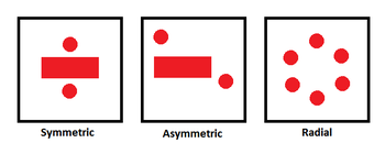
There are three basic forms of visual balance:
  • Symmetrical
  • Asymmetrical
  • Radial


Icon objectives line.svg
Symmetrical balance
Moon jellyfish by Luc Viatour / www.lucnix.be
Symmetrical balance is the most visually stable, and characterized by an exact – or nearly exact - compositional design on either (or both) sides of the horizontal or vertical axis of the picture plane. Symmetrical compositions are usually dominated by a central anchoring element. There are many examples of symmetry in the natural world that reflect an aesthetic dimension. The moon jellyfish fits this description; ghostly lit against a black background, each jellyfish exhibits absolute symmetry in its design.


Sano di Peitro, Madonna of Humility, c.1440, Tempera and tooled gold and silver on panel, Brooklyn Museum, New York
Symmetry’s inherent stability does not always preclude a dynamic quality. View the Tibetan scroll painting to see the implied movement of the central figure Vajrakilaya. The visual business of the shapes and patterns surrounding the figure are balanced by their compositional symmetry, and the wall of flame behind Vajrakilaya tilts to the right. Tibetan scroll paintings use the symmetry of the figure to symbolize their power and spiritual presence. Spiritual paintings from other cultures employ this same balance for similar reasons. Sano di Pietro’s Madonna of Humility, painted around 1440, is centrally positioned, holding the Christ child and forming a triangular design, her head the apex and her flowing gown making a broad base at the bottom of the picture. Their halos are visually reinforced with the heads of the angels and the arc of the frame.


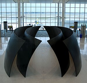
The use of symmetry is evident in three-dimensional art, too. A famous example is the Gateway Arch in St. Louis, Missouri (below, left). Commemorating the westward expansion of the United States, its stainless steel frame rises over 600 feet into the air before gently curving back to the ground. Another example is Richard Serra’s Tilted Spheres (below, right). The four massive slabs of steel show a concentric symmetry and take on an organic dimension as they curve around each other, appearing to almost hover above the ground.


Icon objectives line.svg
Asymmetrical balance
Poster from the United States Library of Congress archives
Asymmetry uses compositional elements that are offset from each other, creating a visually unstable balance. Asymmetrical visual balance is the most dynamic because it creates a more complex design construction. A graphic poster from the 1930’s (on the right) shows how offset positioning and strong contrasts can increase the visual effect of the entire composition.


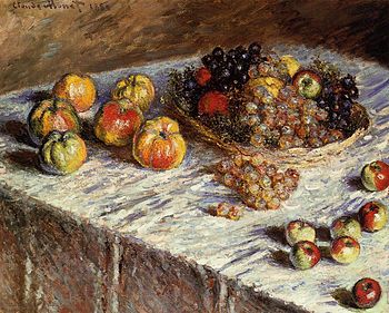
Claude Monet, Still Life with Apples and Grapes, 1880. Oil on canvas, The Art Institute of Chicago, Chicago
Claude Monet’s ‘Still Life with Apples and Grapes’from 1880 uses asymmetry in its design to enliven an otherwise mundane arrangement. First, he sets the whole composition on the diagonal, cutting off the lower left corner with a dark triangle. The arrangement of fruit appears haphazard, but Monet purposely sets most of it on the top half of the canvas to achieve a lighter visual weight. He balances the darker basket of fruit with the white of the tablecloth, even placing a few smaller apples at the lower right to complete the composition. Monet and other Impressionist painters were influenced by Japanese woodcut prints, whose flat spatial areas and graphic color appealed to their sense of design.


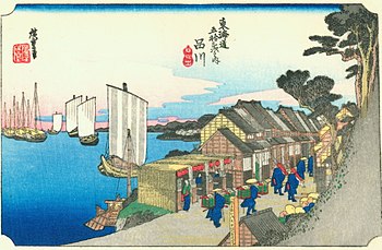
Ando Hiroshige, Shinagawa on the Tokaido, 1833-34. Ukiyo-e print
One of the best-known Japanese print artists is Ando Hiroshige. You can see the design strength of asymmetry in his woodcut Shinagawa on the Tokaido, one of a series of works that explores the landscape around the Takaido road. You can view many of his works through the hyperlink above.


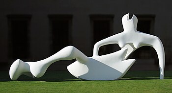
In Henry Moore’s Reclining Figure the organic form of the abstracted figure, strong lighting and precarious balance obtained through asymmetry make the sculpture a powerful example in three-dimensions.
Henry Moore, Reclining Figure, 1951. Painted bronze. Fitzwilliam Museum, Cambridge, England


Icon objectives line.svg
Radial balance
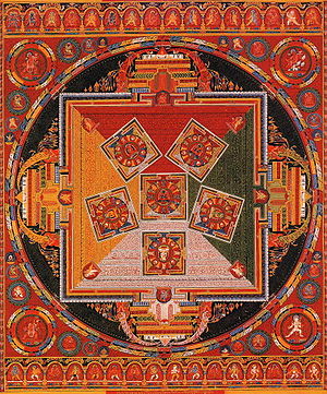
Tibetan Mandala of the Six Chakravartins, c. 1429-46. Central Tibet (Ngor Monestary)
Radial balance suggests movement from the center of a composition towards the outer edge - or vise versa. Many times radial balance is another form of symmetry, offering stability and a point of focus at the center of the composition. Buddhist mandala paintings offer this kind of balance almost exclusively. Similar to the scroll painting we viewed previously, the image radiates outward from a central spirit figure. In the example at right there are six of these figures forming a star shape in the middle. Here we have absolute symmetry in the composition, yet still generating a feeling of movement by virtue of the concentric circles within a rectangular format.


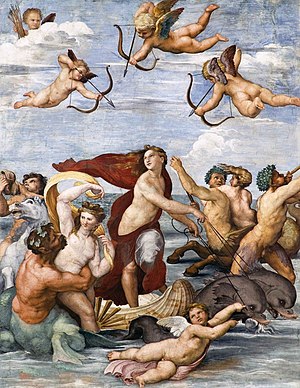
Raphael, Galatea, 1512. Fresco, Villa Farnesina, Rome
Raphael’s painting of Galatea, a sea nymph in Greek mythology, incorporates a double set of radial designs into one composition. The first is the swirl of figures at the bottom of the painting, the second being the three cherubs circulating at the top. The entire work is a current of figures, limbs and implied motion. Notice, too, the stabilizing classic triangle formed with Galatea’s head at the apex and the other figures’ positions inclined towards her, the cherub spread horizontally along the bottom of the composition, similar to di Peitro’s Madonna of Humility.


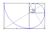
Within this discussion of visual balance, there is a relationship between the natural generation of organic systems and their ultimate form. This relationship is mathematical as well as aesthetic, and is expressed by the term golden ratio. Two quantities will be in a golden ratio, when the larger quantity is 1.618 times the size of the smaller quantity, or equally, the smaller quantity is 0.618 times the size of the larger, offering a kind of mathematical balance. Leonardo da Vinci applied this ratio in his creation of the Mona Lisa.


Icon objectives line.svg
Golden Ratio
In each quarter turn, this golden spiral gets wider by a factor of 1.6, the golden ratio.

To gain a better understanding of a golden ratio, watch the video in the link below, and study the example image at right.

The natural world expresses radial balance, manifest through the golden ratio, in many of its structures, from galaxies to tree rings and waves generated from dropping a stone on the water’s surface. You can see this organic radial structure in some natural systems by comparing the satellite image of hurricane Isabel and a telescopic image of spiral galaxy M51 below.

A snail found in Kinabalu Park, Malaysia.
A snail shell, unbeknownst to its inhabitant, is formed by this same universal ratio, and, in this case, takes on the green tint of its surroundings.


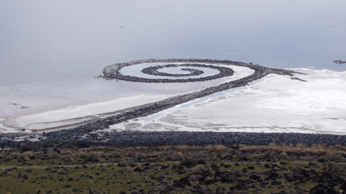
Robert Smithson, Spiral Jetty, 1970.
Environmental artist Robert Smithson created ‘Spiral Jetty’, an earthwork of rock and soil, in 1970. The jetty extends nearly 1500 feet into the Great Salt Lake in Utah, United States, as a symbol of the interconnectedness of our selves to the rest of the natural world.


Comment on the visual balance of any image on this page or one of your own choice (share link to it).

Note: Your comment will be displayed in the course feed.