Working with spreadsheets/Charts/Creating a chart

Working with Spreadsheets
Basic skills applicable to planning, creating and formatting an Excel spreadsheet.
An OP Online course from the National Certificate in Computing (Level 2) programme.
| Working with spreadsheets | |
|---|---|
| Charts | Introduction | Creating a chart | Customising a chart | Key points | Assessment |
What are charts?
With a large sheet of figures and data it may not be easy to “see” what our worksheet is actually showing us. A chart is a dramatic way to represent the information in our spreadsheet.
Charts are used to:
- Illustrate trends, comparisons and relationships
- Emphasise the values of individual items
- Offer an easier and more effective way of presenting your work
Excel contains many different types of chart. It is important to choose the chart type that will give the correct information to your audience. The following information from the Microsoft website may be helpful:
 A column chart shows data changes over a period of time or illustrates comparisons among items.
 A bar chart illustrates comparisons among individual item.
 A line chart shows trends in data at equal intervals.
 A pie chart shows the size of items that make up a data series (see below).
- Data series
- Related data points that are plotted in a chart. You can plot one or more data series in most types of chart, but note that pie charts have only one data series. Each data series in a chart has a unique color or pattern and is represented in the chart legend.
|
Please note: the following link will open in a new window/tab. When you have finished, simply close the window/tab and you'll return to this page.
You might also like to check out the relevant sections of the video on page 2.
|
Inserting a chart
In order to insert a chart into Excel we highlight the range of cells we want to use then go to the Insert Tab > Chart.
Let's create a simple chart:
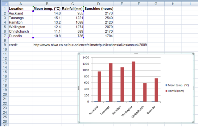
Open Excel and create a new worksheet from the following information:
Here's how your spreadsheet should look:
| A | B | C | D | |
| 1 | Location | Mean Temp (°C) | Rainfall | Sunshine (hrs) |
| 2 | Auckland | 14.6 | 955 | 2176 |
| 3 | Tauranga | 15.1 | 1221 | 2540 |
| 4 | Hamilton | 13.2 | 1088 | 2120 |
| 5 | Wellington | 12.4 | 1274 | 2079 |
| 6 | Christchurch | 11.1 | 589 | 2170 |
| 7 | Dunedin | 10.8 | 736 | 1704 |
| 8 |
- Select the range A1:C7 and choose Insert tab > Charts. Click on the column button and choose clustered column.
- You can see that Excel has put a bar chart into our spreadsheet:
If we click on its border we can re-size or move the chart around. - Save your spreadsheet
