Desktop publishing/DTP overview/Layout and design
| Desktop publishing | |
|---|---|
| DTP overview | Introduction | Key concepts | Layout and design | Planning | Evaluation | Key points | Assessment |
Contents
Elements
Typically, blocks of text and graphics on a desktop published page are placed as elements. Elements are independent: you can place each one exactly where you want it, and you can control its size, shape, and appearance.
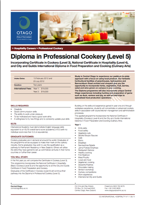
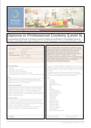
We can also refer to the visual elements of a page. In the sample page below we have framed the main visual elements to emphasise how they've been their placed on the page:
 |
|
| A two-column layout | The same layout with the edges of elements highlighted |
Grids
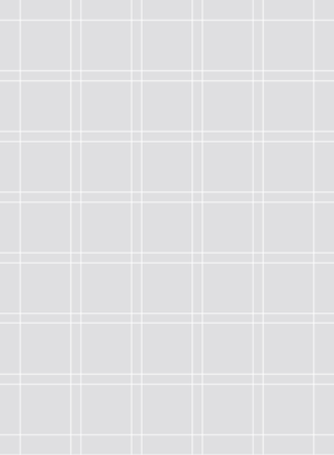
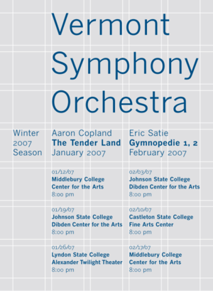
The concept of a grid is often used to help position the visual elements effectively. In the sample above we can see that the visual elements line up with each other as if placed on a grid.
Sample grid
 |
|
| A layout grid composed of intersecting vertical and horizontal lines. | Text elements arranged on the grid. |
Notice that:
- Naturally, the grey background and white lines of the grid are shown as an illustration only - they wouldn't appear in the printed document!
- Some elements are larger than others but still conform to the grid.
- There are areas of white space on the page: that is, empty areas which break up the page and prevent it from being overloaded with text or graphics.
- The page is very simple but effective - it's clean, clear and easy to read.
- The type used is consistent - each of the repeated elements uses the same font size and style.
- Font size and style (eg bold) is used to create a text hierarchy - the relative importance of various text items is clearly visible
When you're getting started, you don't need to worry too much about grids: software such as MS Publisher provides templates with placeholders already positioned and aligned.
|
For more information on grids, check out:
|
Rule of thirds
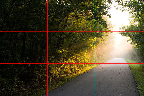
One popular layout for positioning elements on the page, or for photo composition, is the rule of thirds. This layout uses an imaginary grid which divides the page into three, both horizontally and vertically. Elements with their edges placed at one of the lines tend to look pleasing to the eye:
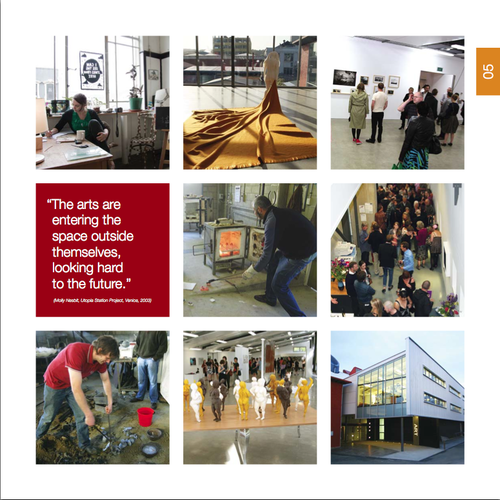
Here's a DTP page which use a three-by-three layout:
Notice:
- The white space between the the 9 page elements and around them as a margin.
- The text element is consistent in size with the image elements
White space
Don’t try to cram too much information on a page. Things that you enjoy reading are generally well spaced out with plenty of blank white space. Headings are generally large enough to stand out by using large font or bold or colour. Pieces of text should be spaced out so that your eye moves from one piece to another. If the publication is well spaced out with a good white margin all round the display, then the reader’s eyes will focus better on the actual content of the publication.
Try not to clutter up your design – don’t choose too many design elements (Word Art, AutoShapes, Clip Art, Graphics, fancy fonts and different colours). Simple, uncluttered designs are much easier to read and understand.
Balance
A pleasing balance can be achieved by ensuring that prominent elements have approximately equal visual weight.
In this page, the two coloured elements (one text and one an image) are symmetrical: they are the same size and shape on either side of the centre line:
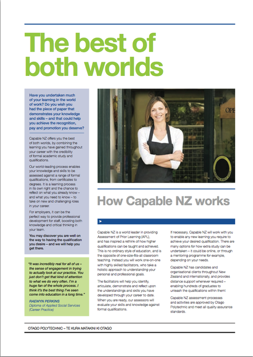
As a contrast, in the page below the image on the right is balanced asymmetrically with the coloured text blocks on the left:
Notice that:
- The image element is darker (therefore heavier) but the text elements are taller and therefore appear to be of equivalent visual weight. Overall, this page seems well-balanced despite the asymmetry.
Colour, texture, shape and line
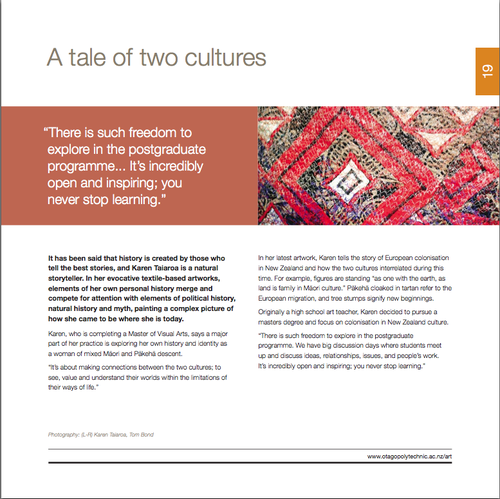
In the page below, the two elements have a predominantly reddish background with white highlights - eg the text in the left hand element. So the two elements have a degree of colour harmony - if the left hand element had been bright green the contrast might overly distract from the content of the page.
Notice how:
- The graphic image also adds interest through texture: the graininess of the printed fabric contrasts with the flat colour of the text element
- The graphic image also adds interest through shape: the diagonals of the diamond pattern contrast with the formal horizontal and vertical lines of the edges of the page elements and add "energy" to the page.
- Lines are used to provide further structure near the bottom of the page and to frame the web address
Applying the design elements
You might find it helpful to print a page or two and start keeping a 'visual diary' of page layout.
|
|
Check out the list of useful online resources in the Reference section.
|


